Card Actions
AEM Assets Content Hub offers the ability to add custom actions to Asset Cards and Collection Cards.
An Asset Card represents an asset in Content Hub. A Collection Card represents a collection. Each card provides an action menu associated with that resource.
Extensions should use the unified aem/assets/contenthub/1 extension point to customize Card Actions.
Custom Asset Card and Collection Card actions
This extensibility feature allows context-aware customization of the action menu associated with an Asset Card or Collection Card.
Using the card namespace, custom actions can be added after the built-in actions. A custom action can adapt its label, icon, and behavior to the current context and selected resource.
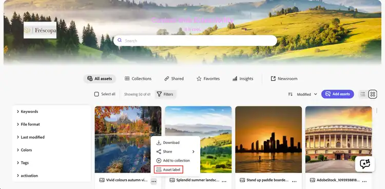
In this example, a custom Asset label action is added to an Asset Card action menu:
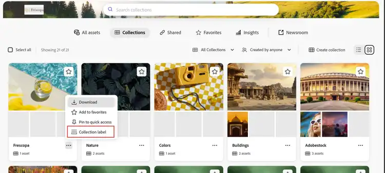
In this example, a custom Collection label action is added to a Collection Card action menu:
API Reference
This API reference is divided into two parts: the API provided by AEM Assets Content Hub to the extension and the API provided by the extension to AEM Assets Content Hub.
Host API Reference
Card Actions can use the Common APIs provided by AEM Assets Content Hub to all extensions. The host communicates the current context and selected resource through the card extension API callbacks described below.
Card context
AEM Assets Content Hub supports Card Actions in two contexts. The current context is communicated to the extension APIs so custom code can adapt to the current area of Content Hub.
- Asset Cards: The action context is
assets. When an action is selected, the resource type isasset. - Collection Cards: The action context is
collections. When an action is selected, the resource type iscollection.
Asset Cards report the assets context in the main assets view, within collections, and in link shares. Only Collection Cards report the collections context.
Extension API Reference
The extension definition object passed by the extension to the register() function defines the card namespace.
The methods in this namespace provide the capabilities to:
- Add custom actions to Asset Cards and Collection Cards.
- Handle user interaction with a custom Card Action.
card namespace
The card namespace includes these two methods:
getActionButtons(actionContext)onActionClick(resourceType, buttonId, resourceId, actionContext)
card.getActionButtons(actionContext)
Description: returns an array of custom action descriptors or an empty array if no custom actions should be added in the specified context.
Parameters:
actionContext(object): Object representing the current Card Action context.context(string): Current context. Possible values areassetsandcollections.
Returns (array): An array of custom action descriptors, or an empty array if no custom actions should be added.
Each array element is a custom action descriptor with the following properties:
id(string): Action ID, unique within the extension.label(string): Custom action title.icon(string): Name of the React Spectrum workflow icon.
Example:
card: {
  getActionButtons({context}) {
    return [
      {
        id: 'customId',
        label: context === 'collections' ? 'Collection action' : 'Asset action',
        icon: 'Form'
      }
    ];
  }
}
card.onActionClick(resourceType, buttonId, resourceId, actionContext)
Description: handles activation of a custom action for the selected Asset Card or Collection Card.
Parameters:
resourceType(string): Selected resource type. Possible values areassetandcollection.buttonId(string): ID of the activated custom action.resourceId(string): ID of the selected asset or collection.actionContext(object): Object representing the current Card Action context.context(string): Current context. Possible values areassetsandcollections.
Example:
async onActionClick(resourceType, buttonId, resourceId, {context}) {
  if (buttonId === 'customId') {
    // Handle the action for the selected resource.
  }
}
Examples
These code snippets demonstrate how the AEM Assets Content Hub sample extension adds a custom action to Asset Cards and Collection Cards and opens a custom dialog when the action is selected. The examples focus on the relevant code and omit some imports and other non-essential details.
The ExtensionRegistration component initializes the extension registration process by calling the register() function provided by the @adobe/uix-guest library.
The object passed to register() describes the extension and its capabilities. In particular, it declares that the extension uses the card namespace and its getActionButtons() and onActionClick() methods:
function ExtensionRegistration() {
  const init = async () => {
    const guestConnection = await register({
      id: 'extension-id',
      methods: {
        card: {
          getActionButtons() {
            return [
              {
                id: 'customId',
                label: 'Custom label',
                icon: 'Form'
              }
            ];
          },
          async onActionClick(resourceType, buttonId, resourceId) {
            if (buttonId === 'customId') {
              await guestConnection.host.modal.openDialog({
                title: 'Custom Dialog',
                contentUrl: `/#card-action-modal?resourceId=${encodeURIComponent(resourceId)}&resourceType=${encodeURIComponent(resourceType)}`,
                type: 'modal',
                size: 'M'
              });
            }
          }
        }
      }
    });
  };

  init().catch(console.error);

  return <Text>IFrame for integration with Host (Content Hub)...</Text>;
}

export default ExtensionRegistration;
Example of context-aware Card Actions
The context value can be used to return different actions for Asset Cards and Collection Cards. In this example, the extension adds one action only to Asset Cards and a different action only to Collection Cards:
card: {
  getActionButtons({context}) {
    if (context === 'assets') {
      return [
        {
          id: 'assetAction',
          label: 'Asset action',
          icon: 'Image'
        }
      ];
    }

    if (context === 'collections') {
      return [
        {
          id: 'collectionAction',
          label: 'Collection action',
          icon: 'Folder'
        }
      ];
    }

    return [];
  }
}
Example of handling a Card Action
The sample passes the selected resourceId and resourceType to a custom dialog through the dialog URL. The dialog route reads those values, connects to AEM Assets Content Hub using attach(), and can close itself using the Modal API:
export default function CardActionModal() {
  const [guestConnection, setGuestConnection] = useState(null);
  const [resource, setResource] = useState(null);

  useEffect(() => {
    (async () => {
      const params = new URLSearchParams(window.location.hash.split('?')[1] || '');
      setResource({
        resourceId: params.get('resourceId'),
        resourceType: params.get('resourceType')
      });

      const connection = await attach({id: 'extension-id'});
      setGuestConnection(connection);
    })();
  }, []);

  return (
    <Provider theme={defaultTheme} height="100vh">
      <View padding="size-400">
        <Heading level={3}>Custom Dialog</Heading>
        <Text>Resource Type: {resource?.resourceType}</Text>
        <Text>Resource ID: {resource?.resourceId}</Text>
        <Button
          variant="accent"
          onPress={() => guestConnection?.host.modal.closeDialog()}
        >
          Close
        </Button>
      </View>
    </Provider>
  );
}
See the complete registration component and Card Action dialog component in the sample application.