Introduction
CoralUI has roots as an internal Open Development project, with core volunteers working on this problem since 2012. As of 2016, the effort has become part of the One Adobe & Cloud Platform effort, which means building a full CoralUI team that includes Exec Leadership, PgM, PM, EM, Dev, and QE members. CoralUI is also becoming a One Adobe Technical Standard, meaning it will be used as the default platform for web projects.
Unified Experience
Our vision is to create consistent Adobe experiences by providing a complete, easy to use library of HTML components. Standardization on CoralUI allows teams to reduce code duplication and variation and encourages company wide collaboration. This reduction in effort means teams can focus on meeting customer needs, not reinventing the wheel. Use of CoralUI also enables easy, unified design updates, and provides a library that is under Adobe’s full control.
Enhanced API
CoralUI's components are essentially extended DOM elements. We enhance the existing API with additional functionality, as well as providing some patterns that aren't available with native HTML alone. Since we expose a JavaScript API that’s based on the native DOM API and has all of the same methods as any other HTML element instance, anyone familiar with the DOM already knows most of the API works. Where it has been extended, each component is well documented, with most having a 'configurator' that allows experimentation with the component right here. Each component also has detailed JSDoc documentation for understanding what APIs are exposed. There is also some common API described in the Base Classes and Interfaces sections below.
Most API is available via markup, so don’t have to write JavaScript for most basic uses. All you have to do is write the markup for a component, just like you would a normal HTML element.
See the Components section of this site to get started exploring what is available.
Future Thinking
CoralUI is pushing the web forward by beginning to implement the Web Components specification in our library. However, given the landscape of browser implementation and the state of the polyfill ecosystem, we decided to only implement custom elements at this time.
A strong advantage CoralUI derives from custom elements is the ability to hide many implementation details from the consumer. More to the point, we found that designs become closely tied to their markup. The use of custom elements allows much more freedom to change the underlying markup that supports those elements. This makes the exposed API smaller and more explicit, resulting in a lower risk of updates to CoralUI needing to introduce breaking changes.
In addition, every Coral component is an HTML element. This give us the ability to create components from markup or JavaScript and lets us treat them like any other native element, setting properties, appending them in the DOM, etc. Following the patterns used in actual HTML elements, we use JavaScript’s native prototype driven inheritance.
For more detail, see the webcomponents section of the Architecture documentation.
Themed CSS
CoralUI has recently been updated to provide CSS via themes. This creates a better separation between the structure of each component and it's styles. Now the look of an entire CoralUI build can be changed by simply creating a custom build and changing the theme.
As of now, only two themes are available. The current default theme is CloudUI, with an optional Spectrum theme.
Open Development
Since 2012, CoralUI has been an open development project driven by a group of dedicated engineers from various teams across the company. As CoralUI adoption increases, we are building up CoralUI in to a full time, dedicated team. However, CoralUI will remain an open project, with the goal of becoming public open source in the near future. All are welcome to contribute. See the Contribution section below for more detail.
Accessibility
Having an inaccessible application can mean thousands of dollars of fines if you land a government contract. It also means alienating an entire segment of society by making your application completely unusable to them. To help you avoid this, we’ve made it a rule that every CoralUI component should be accessible. We’ve also built a few things into CoralUI 3 to make implementing accessibility easier for component authors and consumers alike. We leverage Coral’s overlay mixin to help keyboard users work more easily with overlays, and Keys makes it easier to implement keyboard support for components.
Browser Support
CoralUI is designed to support the following browsers:
-
Chrome (latest)
-
Safari (latest)
-
Firefox (latest)
-
Edge (latest)
-
IE 11
-
iOS 7+
-
Android 4.4+
i18n
CoralUI provides a robust internal system for internationalization of its strings. This can also be used to provided localized content and data inside your application. This is done via our build process and Adobe's Aladdin service. With a few easy steps, translations can be downloaded and included in the deployed resources of your code. The API for this includes simple functions for getting translated strings, substitution within strings, and the use of translation hints.
See the Coral.i18n class documentation for more API details.
Developer Fundamentals
Programmatically interacting with components
The Components Docs provide detailed information on each component in CoralUI,including the different attributes available, and built-in methods and events on the JavaScript components.
Here are some quick steps to get you started with JavaScript components:
Coral UI 3 widgets can be instantiated using a Coral class instance:
/* Alert - Coral class constructor*/
var alert = new Coral.Alert();
alert.header.innerHTML = "Hey!"
alert.content.innerHTML = "This is an alert.";
alert.variant = "info";
Or by creating a HTML Element directly:
/* Alert - DOM element */
document.createElement('coral-alert');
Programmatically interacting with sub-components
Let's say we create an element and add some Coral components to it with markup:
var el = document.createElement('div');
el.innerHTML = '<coral-numberinput></coral-numberinput>';
document.body.appendChild(el);
One would expect we could now do something like this:
var numberInput = el.firstElementChild;
numberInput.value = 10;
This works great in Chrome (which has native Custom Elements support), but does nothing in both Firefox and IE 9 because the element hasn't been upgraded yet.
The workaround is to use the method Coral.commons.ready(el, cb):
var numberInput = el.firstElementChild;
Coral.commons.ready(el, function()
  numberInput.value = 10;
});
Coral.commons.ready(el, cb) will force an upgrade on the component and its sub-components before calling the provided callback.
This is the full code example :
var el = document.createElement('div');
el.innerHTML = '<coral-numberinput></coral-numberinput>';
var numberInput = el.firstElementChild;
document.body.appendChild(el);
// add callback
Coral.commons.ready(el, function() {
  numberInput.value = 10;
});
Result: The above code works in all supported browsers, all of the time.
Background
In browsers, that have native support for custom elements, components are upgraded and ready to go immediately. However, in polyfilled environments, MutationObservers are used to determine
when elements are added and need to be upgraded. MutationObservers queue "microtasks", which fire event listeners before the next animation frame. As such, accessing the component API
of an element created from markup has to happen on the next animation frame. In browsers, that implement requestAnimationFrame, we can simply insert dynamic markup, then wait for the
next animation frame and execute the callback, while being certain that all custom elements have been upgraded.
Read more about Custom Elements.
Creating components
The magic of creating components begins at Coral.register(). This is used to define the JavaScript "class" that will be instantiated for each component. Let's take a look at creating a simple component to display the weather:
Coral.register({
  name: 'Weather',
  tagName: 'coral-weather',
  className: 'coral-Weather',

  properties: {
    temperature: {
      default: 70,
      transform: Coral.transform.number,
      sync: function() {
        this.innerHTML = 'It\'s ' + this.temperature + '° outside today!';
      }
    }
  }
});
namedefines the class name of the component witihin theCoralJavaScript namespace. Here we've given the valueWeathermeaning if consumers wished to instantiate the weather component they would do so usingnew Coral.Weather();.tagNamedefines the element tag name used within markup to instantiate the component. Here we've given the valuecoral-weathermeaning if consumers wished to instantiate the greeting component using markup they would do so using<coral-weather></coral-weather>.propertiesdefines an object of property names with their accompanying descriptors. These are properties that consumers can use to the interact with the component. Here we've defined anameproperty.
Property descriptors support a plethora of configuration. For the temperature property we've defined the following:
defaultdefines the default value of the property. Here we've defined a default of70meaning if a consumer doesn't specify atemperaturevalue then we would like CoralUI to automatically set thetemperatureproperty to70.transformdefines how a value should be transformed when being set. For example, if a consumer specified a temperature via markup (<coral-weather temperature="35"></coral-weather>) the value would by default be treated as a string. In our case, however, we want to deal with the value as a number since we may want to eventually compare it to other temperatures to determine if it's hot or cold, etc. CoralUI provides multiple built-in transforms to leverage or you can provide your own. This example leverages the built-in number transform. This helps guarantee thatthis.temperaturewill always be a number.syncdefines what action should be taken when the property changes. This example updates the content of the component to display the temperature. Note that for optimization purposessyncis called a maximum of once per animation frame regardless of how many times the property is set between animation frames. This minimizes the amount of DOM churn.
Mixin Usage
Coming soon
Customizing Styles
Coming soon
Testing
Coming soon
Internationalizing components
CoralUI supports internationalization (i18n) of strings through the Coral.i18n service.
Scope
Only native CoralUI strings are localized by CoralUI's internationalization mechanism. User-provided strings, such as button labels, or placeholder strings, are not covered, and thus will need to be handled by the consuming product's localization process.
Getting started
To internationalize a CoralUI component, use the Coral.i18n.get call for every string in your component that you wish to localize. Here are a couple of examples:
JavaScript
- this._elements.label.textContent = 'Select';
+ this._elements.label.textContent = Coral.i18n.get('Select');
HTML template (DOMly)
- <button class="coral-QuickActions-button" is="coral-button" icon="more" title="More actions"></button>
+ <button class="coral-QuickActions-button" is="coral-button" icon="more" title="{{Coral.i18n.get('More actions')}}"></button>
Existing translations are built into CoralUI at build time. If a translation is available for the string you externalized, it'll show in your product's localized web page. Otherwise, it'll be necessary to extract it and upload it to the translation server (see the 'Extracting strings for translation' section for more details).
Setting the locale
The language of the translated strings is determined by the document's language attribute (e.g. <html lang="fr-FR">).
Note: Make sure that the document has its encoding set to UTF-8 (i.e. <meta charset="utf-8"> )
Using arguments
Coral.i18n.get accepts arguments:
var givenName = 'Marco';
var familyName = 'Tardelli';
var welcomeMsg = Coral.i18n.get('Welcome {0} {1}', givenName, familyName); // => "Benvenuto Marco Tardelli"
Using translation hints
Coral.i18n.get accepts translation hints:
Coral.i18n.get('Increment', 'this is a verb'); // => "Incrementar"
Coral.i18n.get('Increment', 'this is a noun') // => "Incremento"
Translation hints provide context to translators, and thus their use is strongly encouraged.
Storage and management of translated strings
CoralUI translations are stored in the Aladdin translation server. When translations are updated (as part of bug-fixing), this is where the updates take place.
In order to be used with CoralUI components, these translations have to be included in a local file in the component's directory. The Downloading translated strings section explains this process in more detail.
Aladdin periodically sends for translation any new strings that were extracted from Coral components (see the 'Extracting strings for translation' section for more details), so no direct involvement from developers is necessary. The turnaround time for translations for new strings is approximately one week.
Currently translations are available in 9 languages: French, German, Italian, Spanish, Brazilian Portuguese, Japanese, Korean, Simplified Chinese and Traditional Chinese.
Extracting strings for translation
After strings are internationalized, it's necessary to extract them from the source file(s) and upload them to Aladdin.
The extraction and uploading of localizable strings can be accomplished by running the following grunt command:
$ grunt i18n-extract
Downloading translated strings
Ocasionally translated strings change as result of fixing a linguistic bug. When this occurs, it's necessary to download the updated strings from Aladdin, and to commit them to GitHub.
The downloading of localized strings can be accomplished by running the following grunt command:
$ grunt i18n-download
Translated strings are stored in the <component>/i18n/translations.json file of each CoralUI component that is localized.
Calendars
Localized Gregorian calendars are available. For information on how to use them, see the 'Working with Locales' section of the Calendar component documentation.
Date pickers
Localized date pickers (based on Gregorian calendars) are available. For information on how to use them, see the 'Working with Locales' section of the Datepicker component documentation.
Architecture
Overview
This section describes a bit about how CoralUI works. CoralUI has been evolving since 2012. Below are some details around the technical decisions behind the architecture of CoralUI 3.
Web Components
CoralUI hides implementation detail from consumers by leveraging the Custom Elements specification, which is part of the emerging Webcomponents standard.
Custom elements allow CoralUI to define new types of DOM elements to be used in an HTML document. As a result, CoralUI can extend native elements like a button or text input to provide additional functionality or it can provide completely new elements like a progress indicator or accordion. Consumers can then use these elements using their custom tags (e.g., <coral-progress>) and directly interact with their custom properties.
Custom elements are not currently supported natively in all target browsers. To allow CoralUI to function properly in all target browsers, a custom elements polyfill has been included with CoralUI which supplies necessary support when native support is not available. This polyfill only adds 5,430 bytes minified + gzipped.
A strong advantage CoralUI derives from custom elements is the ability to hide many implementation details from the consumer. While a progress indicator may be composed of a variety of spans, divs, or images, these are underlying details that shouldn't concern consumers. Rather than consumers copying and maintaining large swaths of code containing all these elements with their various attributes, they are typically able to use a simple custom element tag and the underlying elements are seamlessly produced by CoralUI on their behalf. By keeping implementation details internal to components, the exposed public API is minimized and more explicit resulting in a lower risk of introducing breaking changes. This, in turn, speeds up the CoralUI development process.
For now, we have not implemented ShadowDOM, HTML Imports, or other aspects of the web components specification. Also, while the custom elements polyfill we use was born as part of the Google Polymer project, we found Polymer too opinionated in general to simply adopt it as a whole. Thus, our library builds in only the custom-elements polyfill on it's own.
Content Zones
Without shadow DOM, we need some way to mix user-provided content with presentational elements. Our answer to this is content zones. Essentially, we have simple, brainless HTML tags that serve as wrappers for content. Users provide these tags when creating elements from markup, and after we render the DOMly template, we simply move these content zones into place.
This Coral.Alert markup shows content zones for header and content areas of the component:
<coral-alert>
  <coral-alert-header>INFO</coral-alert-header>
  <coral-alert-content>This is is an alert.</coral-alert-content>
</coral-alert>
Additionally, in the same way you can access the body of the HTML document with document.body, we create references for each content zone on the JavaScript object that corresponds to the component. You can access the header content zone with dialog.header and change its innerHTML, append elements, or do whatever else you need to do.
Since we are not using actual ShadowDOM, our CSS is not protected. However, since CoralUI 2 we have used a SUIT CSS naming convention to keep Coral’s CSS conflict-free. Adding overly general CSS could still affect Coral components — which is both a bug and a feature — but Coral components won’t mess with other unrelated page elements.
Polyfill Perks
Through the polyfill, we also get access to:
These are used a few places in CoralUI, and are also available for use by your application.
Synchronization Quirks
Because of quirky of a polyfilled environment, there are some known issues that must be worked around. In browsers that support web components natively, such as Chrome, elements are upgraded immediately, regardless of how they’re created. However, in polyfilled browsers, this isn’t the case.
In order to provide support for web components on old browsers, our polyfill uses MutationObservers to watch for elements it should upgrade. When you create elements from markup, they’re not upgraded until the MutationObserver fires, which happens asynchronously. As a result, you can’t use the JavaScript API of an element created from markup immediately after you insert it.
The code below will exhibit a synchronization problem in polyfilled browsers:
document.body.innerHTML = '<coral-progress id="progress"></coral-progress>';
document.querySelector('#progress').value = 100;
A curious side effect of the above code snippet is that now the value property is broken for that instance. Because of the way that webcomponents.js upgrades elements by switching out their prototype, setting the value property before the upgrade makes it so the value property defined on the prototype is effectively overridden by the value property defined on the instance. Basically, this breaks things.
The two examples below work everywhere:
document.body.innerHTML = '<coral-progress value="100"></coral-progress>';
<!-- or -->
document.body.innerHTML = '<coral-progress id="progress"></coral-progress>';
document.querySelector('#progress').setAttribute('value', 100);
You can still set attributes on the element, either with JavaScript or within the markup itself. This works because Coral will check the existing attributes and apply them when the element is upgraded. If you’re doing something like rendering a template, you can pass configuration in as attributes. You can also use setAttribute and be confident it will always work, even after the element has been upgraded.
There is a Coral.commons.ready function that is also helpful:
Coral.commons.ready(document.querySelector('#progress'), function(progress) {
  progress.value = 100;
});
DOM Updates
We wanted Coral components to be good citizens. We didn’t want them causing unnecessary recalculations and paints at the wrong times, eating up CPU and draining battery on mobile devices. As such, many properties of Coral components won’t immediately result in changes in the DOM. After setting a property, it may take up to 2 animation frames before the DOM reflects your changes, but you can trust that getting the property value will return what you set, and that the component will be visually updated before the next paint.
In most cases, this isn’t something you’ll notice when using Coral in your application. However, if you try to get a Coral component’s clientRects or offsetWidth after setting a property, you might notice they don’t immediately reflect your changes.
Certain properties are always updated synchronously, such as content properties used on container components or name and value properties in field components. This makes it so any content you add will be immediately available for querying, and your form submits will always have the right name and value.
Collection Updates
Because we’re using real DOM nodes to represent items in a collection, we use attached and detached events to know when items are added and removed. Because the webcomponents.js polyfill relies on MutationObserver to know when an element has been added or removed, these events are asynchronous.
As such, a collection won’t fire an added event until the item tells the collection it has been added. This will happen before the next animation frame, before the next paint, so users will never be the wiser, but you might be confused when add events happen asynchronously.
CoralUI Core
As CoralUI has evolved, the importance of the coralui-core component has diminished.
Still, a build of CoralUI must include the coralui-core component. This repository
contains some common styles and resources needed for all components.
The most important of these is the /externals directory, which contains dependencies
required by CoralUI's JavaScript. This is primarily jQuery (2.1.0), but also includes some helper
JS for TypeKit, and moment.js if Coral.Calender is built. More on this is found in the
dependencies documentation.
It's also important to know that CoralUI's core includes normalize.css (3.0.2). Using a common CSS reset is good practice for getting CoralUI to be consistent across browsers. However, if your project's code also includes CSS resets, this may be redundant or even cause conflicts. The recommendation is to use CoralUI's included reset.
In addition, some the 'style-only' components are found in coralui-core]. Details on those components
can be found in the Styles section of this website.
Coral.Component
All CoralUI components are based on the Coral.Component class. The source of this
class is in the coraliu-component repository.
Coral.Component provides:
- Event Delegation
- Key Combo Listeners
- Lifecycle Events
- Component Property Setup
- Sub-element Caching
- Visibility Methods
- Batch Property Sets
- Event Add/Remove/Trigger Support
Under the hood, everything extends Coral.Component.
Coral.Component provides all the basics every component needs — event delegation with Vent, key combo listeners with Keys, lifecycle events with webcomponents.js, template rendering with DOMly, et. cetera.
It sets up default property values and reads attributes from the DOM for you, assigning the corresponding property to the right value.
It also caches sub-elements, so we’re not stuck querying the DOM every time we need to change something.
An API-focused look at Coral.Component is provide in the base classes documentation.
Coral.Component Register
A critical part of Coral.Component is the #register() functions. It enables:
- Extending native HTML tags
- Simple prototypal inheritance
- Functional and object mixins
- Defining and overriding properties
- Defining and inheriting delegated events
- Registers new HTML tag in document
- Declares components in
Coralnamespace
Coral.register is the glue that combines everything together. It’s a simple function that lets us declare web components without hassle. We can extend existing HTML tags, inherit from other Coral components, add mixins, as well as define and override property descriptors and events listeners. Coral.register makes sure you pick up everything Coral.Component has to offer, even if you extending existing tags or other components.
Coral.register({
  name: 'FieldOverlay',
  tagName: 'coral-fieldoverlay',
  className: 'coral-Overlay coral-FieldOverlay',
  extend: Coral.Overlay,
  mixins: [ Coral.mixin.fieldComponent ],
  properties: {
    'value': { /* ... */ }
  },
  events: {
    'change input': '_handleChange'
  },
  _render: function(event) { /* ... */ }
  _handleChange: function(event) { /* ... */ }
});
Coral.register enhances JavaScript’s property descriptor by providing web component-specific features. Under the hood, we’re still simply using JavaScript setters and getters, but we enhance the setters to perform a number of web-components specific tasks.
properties: {
  'value': {
    default: 0,
    attribute: 'value',
    reflectAttribute: true,
    transform: function(value) {},
    attributeTransform: function(value) {},
    validate: function(value, oldValue) {},
    set: function(value) {},
    get: function() {},
    sync: function() {},
    alsoSync: ['other'],
    trigger: 'coral-component:change',
    triggerBefore: 'coral-component:beforechange',
    override: true
  }
}
Coral.register supports a very flexible event map. This allows us to easily perform:
- delegation
- capture events
- global events
- key events
- key events with delegation
- key combos
Coral.Component manages global events for you, adding and removing them as necessary. And of course, Vent and Keys do the work under the hood.
events: {
 'click [coral-close]': '_handleClose',
 'submit .js-form': '_handlesubmit',
 'capture:change [name="field"]': '_handleChange',
 'global:resize': '_handleWindowResize',
 'key:right': '_handleKeyRight',
 ‘key:enter [name=“field"]': '_handleEnter',
 'key:control+a': ‘_handleSelectAll',
 'global:key:escape': '_handleEscape'
}
Spectrum and CSS
Spectrum is Adobe's unified design language. The Spectrum theme for CoralUI uses the Spectrum Design System projects. For problems related to Spectrum, please refer to the Spectrum JIRA project. You can find out more about Spectrum via the Spectrum website.
CoralUI's CSS attempts to achieve the following goals:
- Compatible: Does not conflict with styles in the consuming project.
- Optimized: Fast!
- Readable: Conveys context based on the CSS class name alone.
- Extensible: Maintains flexibility by limiting assumptions concerning DOM hierarchy.
To help achieve these goals, CoralUI follows the SUIT CSS convention. SUIT was chosen over alternative conventions because it is opinionated and well-documented. It also provides a favorable naming style and outlines patterns for handling states, utilities, and JavaScript interaction.
Another tactic CoralUI uses to maintain compatibility with consumer projects is to make styles opt-in-only. In other words, if CoralUI's stylesheet is loaded into a consumer project with no other changes, the look and feel of the consumer project should not change. The only exception to this is that CoralUI comes bundled with Normalize.css which attempts to normalize default CSS styles across browsers.
CoralUI components should avoid requiring that consumers add CSS classes to components; CoralUI components have logic capable of adding CSS classes to their own elements as necessary. They may even add or remove CSS classes based on a property value. On the other hand, there are styles CoralUI provides that do not have accompanying components. For example, table styles are provided for consumer use but no accompanying table component. In these cases, consumers are expected to use the CSS classes directly.
Theme Structure
Theme support in CoralUI is achieved by moving the CSS for
a CoralUI component from the component's repository to a theme repository.
CoralUI's build system merges the correct CSS for all included components into a
single CSS instance. By design, the theme repository contains source CSS for
every CoralUI component. There is no need to remove components when creating
a custom build. The build system is smart enough to only output CSS for
components that are included in the package.json of a build.
More detail is available in the Styles section of this site, or you can view Spectrum in action via a Spectrum themed build of this website.
Dependencies
CoralUI has a few dependencies. Some are actually written and maintained by the CoralUI team, and are included in CoralUI without being considered an external dependency.
These 'non-external' dependencies are:
DOMly

DOMly is CoralUI's template language. It has a simple, HTML-like syntax, so there’s no learning curve as with Jade and Handlebars. DOMly templates compile to a basic JavaScript functions that use native DOM operations and, as a result, has zero client-side dependencies. DOMly is the fastest client-side template system out there. DOMly selectively uses cloneNode to make things even faster, which is also where it gets part of its name from — Dolly the sheep, the first mammal to be cloned.
Below is some advanced DOMly markup that loops over products and displays them in a list, generating some unique IDs, and setting a few attributes conditionally:
<h1>Category: {{data.category}}</h1>
<if data.items.length>
  <ul>
    <foreach data.items>
      <li id="{{util.generateId()}}">
        <h2>{{parent.category}}: {{data.name}}</h2>
        <h3 if-data.sale='class="sale"'>{{data.price}}</h3>
        <strong>{{format(data.count)}} in stock</strong>
        <button unless-data.count='disabled="disabled"'>Buy now</button>
      </li>
    </foreach>
  </ul>
<else>
  <p>This category is empty.</p>
</if>
Coral components leverage templates inside their _render method to fill in any missing DOM that wasn’t provided by the user. Components won’t re-render the template unless something drastic changes, so all further operations simply mutate the DOM that’s already there. This is our answer to the no-quite-ready ShadowDOM specification.
Vent

When we started building web components, we realized that Custom Events would be a big part of what we did, and that jQuery didn’t support them at all. We found that all existing solutions lacked features, had crippling bugs, or didn’t have tests. After realizing there was more wrong with existing options than was right, we created Vent.
Vent treats CustomEvents like real, bubbling DOM events, dispatching and listening to them like any other native event. This lets our components trigger events that your application can listen to at any level in the DOM tree using native addEventListener.
Vent also supports capture phase listeners, unlike jQuery and other event delegation libraries. This lets us have fine-grain control over when we listen to events as they propagate.
Vent has support scoped selectors, so you can delegate to immediate children if you need to. This behavior simply wasn’t present in any existing library except jQuery, and we needed it for Coral.
As an example, here’s code that uses Vent to listen to clicks that only happen on elements within component that have the .sub-element classname.
var vent = new Vent(component);
vent.on('click', ‘.sub-element’, callback);
Keys
A common practice is to handled key press activity by hard coding key codes into event handlers. This was an obvious area where we could improve, so we looked for a library that would give us the ability to listen to key combinations on a per-component basis with event delegation. It turns out, existing solutions such as jquery.hotkeys and Keymaster had serious issues and shortcomings. Thus, our Keys library was born.
Keys enables listening to key presses, key combinations, and the event delegation pattern for key presses.
Keys makes it simple to listen to key presses and combinations, and you can use its built-in support for the event delegation pattern to listen for events on specific elements. There’s a global instance exposed at Coral.keys that you can use to implement additional key combo support.
Others
There are also some more traditional dependencies. They are:
- jQuery
- jQuery UI Core
- jQuery UI Position
- Moment.js
- Normalize.css
There is a plan to eventually remove jQuery, but as of today we're still using it for a few things. An example is the add/remove class functionality, and some advanced DOM queries, but we’re avoiding it in most cases and using the native DOM API.
Build System
TODO: what is the current state of the build system
TODO: what are our plans to update it?
TODO: how does the guide get created and deployed
TODO: how to pull request improvements to the guide
Base Classes
Coral.Collection
See Documentation for Coral.Collection
Coral.commons
See Documentation for Coral.commons
Coral.Component
See Documentation for Coral.Component
Coral.i18n
See Documentation for Coral.i18n
Coral.Keys
See Documentation for Coral.Keys
Coral.mixin.formField
See Documentation for Coral.mixin.formField
Coral.mixin.overlay
See Documentation for Coral.mixin.overlay
Coral.mixin.selectionList
See Documentation for Coral.mixin.selectionList
Coral.property
See Documentation for Coral.property
Coral.transform
See Documentation for Coral.transform
Coral.validate
See Documentation for Coral.validate
Interfaces
CoralUI provides some interfaces, which are documented in each component's JSDocs. Additional detail on those interfaces is provide below.
Collection Interface
Some components like Select or TabList include multiple items. As an effort to standardize manipulation of these items, we've added a Collection interface, which provides a consistent API for handling multiple items within a component. The Collection Interface is exposed via an items property that gives access to different methods to manipulate items.
Components that support the Collection interface expose the details in their JSDocs.
Form Fields
Components that are typically used inside a form follow a contract that exposes a set of required properties. We call this the FormField interface. Every component in a form is expected to have the following properties: disabled, invalid, labelledBy, name, eadOnly, required, and value. FormField components also trigger a change event without a namespace, which allows the components to be integrated transparently into any form.
Demo Applications
The CoralUI team has provided a demo application for helping understand the usage of CoralUI. This application also provides an example of different variations that might be needed when implementing CoralUI.
The app itself is a simple interface for finding conference rooms in the Adobe office in Lehi, UT. It offers a example of using many common CoralUI components, but is not exhaustive.
The demo application repository contains an /examples folder where variant of the CoralUI is found. There are explained below.
In addition, each branch of this repository changes the CSS theme used by the demo app.
- theme-spectrum is built with the Spectrum theme.
- cloudui-spectrum is built with the CloudUI theme (CoralUI's default).
A build of each of the example variants is available to view at the following URLs:
| Variant | Themed Example | |
|---|---|---|
| Vanilla JavaScript | CloudUI | Spectrum |
| AngularJS | CloudUI | Spectrum |
| Torq | CloudUI | Spectrum |
See the repository README file for more detailed instructions on using the demo app.
CoralUI 3 Migration
The purpose of this section is to ease the migration process, mostly by providing an overview of where there is a difference in the components between older versions and CoralUI 3.
Custom Elements
As described elsewhere in the architecture documentation, CoralUI 3 replaces the traditional markup of CoralUI 2 with Web Components'sCustom Elements. Custom Elements allows the developer to register new tags that serve as components that can be easily reused. This abstracts and simplifies the markup required to initialize each component and eases the process of passing options to each component.
Empty Element
For <coral-icon>, <coral-numberinput>, etc, even though they don't have any body, the end tag is required. i.e. You have to use <coral-icon></coral-icon> instead of <coral-icon />. Otherwise the browser will consider it unclosed element and will close it like a block element.
Object References
The CoralUI 2 implementation stored the JavaScript object as a data attribute. This required using var numberinput = $("#elementId").data("numberinput") to allow access to the API. Because CoralUI 3 components are now Custom Elements, there is not a separate data object. The element contains itself the API, just like a native HTLM Element.
This means that CoralUI 3 JavaScript construction can be done without pre-existing DOM markup, and initialization parameters are now passed as normal element attributes. This also has an impact on how properties are set. In CoralUI 2, we had to interact with this data object, and set the options that it provided. Now, every property is exposed with a JavaScript setter and getter.
Data Attributes
In CoralUI 2, data attributes were used to pass options to the component constructor. For example, CUI.NumberInput required data-min, data-max, and data-init to initialize the markup as a NumberInput. You were also forced to write the complete internal markup of the component and then reference it in the DOM when initializing the JavaScript.
Since components are now treated as normal DOM element, initialization parameters are passed as normal element attributes, not data attributes.
Platform Changes
-
The event
cui-contentloadeddoes not exist anymore. Since we are using custom elements, they get upgraded automatically by the browser. -
No more
data-*attributes. As indicated previously, now they are full fledged attributes. -
No more need to retrieve the underlaying JavaScript object using
$("#myNumberInput").data("numberInput");. As mentioned above, object references are the same as any other DOM element. - The new Collection interface that standardizes the item manipulation (mentioned above).
- A FormField interface that exposes the expected properties for every form component (mentioned above).
Component Changes
With CoralUI 3, some components have been renamed or deprecated. This section provides a quick overview.
New Components
- Coral.ActionBar
- Coral.Calendar
- Coral.Card
- Coral.Clock
- Coral.Masonry
- Coral.PanelStack
- Coral.Table
- Coral.TabList
Renamed Components
CUI.Modalis replaced byCoral.DialogCUI.TabPanelis replaced byCoral.TabView, which is used in conjunction with aCoral.TabListand aCoral.PanelStackCUI.FlexWizardis replaced byCoral.WizardView, which is used in conjunction with aCoral.StepListand aCoral.PanelStack
Former Core Components
In CoralUI 3, many of the former 'core' components have been promoted to become a custom element. This includes some addition of JavaScript APIs for those components.
- Those components are:
- Coral.AnchorButton
- Coral.Button
- Coral.ButtonGroup
- Coral.Checkbox
- Coral.Icon
- Coral.Progress
- Coral.Radio
- Coral.RadioGroup
- Coral.Table
- Coral.TextField
- Coral.TextArea
- Coral.Wait
Other Notes
coral-Button–secondaryhas been removed; light grey is now the default button colorcoral-MinimalButtonhas been incorporated as a variant ofCoral.ButtonCoral.DatePicker: the options 'dayNames' and 'monthNames' have been removed. In the future they will be taken automatically from i18nCoral.NumberInput: the option 'defaultValue' has been removedCoral.PanelStackdoes not have padding;u-coral-paddingneeds to be usedCoral.Selectdropped support for groupsCoral.Switchdoes not support labels. A switch should only be used to express on/off or enable/disabled, thus does not need additional label support
Contribution
Open Development
CoralUI follows open development principles for our project.
The main open development principles for CoralUI's open development community are:
- The code is discoverable and openly available to anyone.
- Discussions about CoralUI happen on an open and archived mailing list.
- All important technical decisions are exposed on that list.
- All commits are backed by issues in an openly accessible tracker, which offers a self-service overview of the project's status and history.
- Wikis and blogs are used for durable information, as opposed to email which is mostly throwaway.
- People who are not members of the core team are encouraged to provide contributions.
- Meritocracy is taken into account when considering the priority of contributions and suggestions. The more you contribute, and the more valuable your contributions are, the more influence you will have within the project.
CoralUI's development principles are based on the Day Team's original model.
Finding Tasks
First, contact the CoralUI development community via <DL-CoralUI-dev>coralui-dev@adobe.com. You should introduce yourself and announce your intent to contribute. The core team is active on that list, and they will be glad to help you get started. You can also register for our Slack channel at 'coralui.slack.com'.
All CoralUI work is tracked in our JIRA project. Before you look there, be sure you've contacted the community ;) We prioritize blocker and critical defects first, though submissions of new components and other 'non-bug' contribution is welcome. Just talk to the community and we will work it out.
Once you are ready to submit a bug, find an issue to fix, find a feature to work on, or document a new task, go to JIRA. Everything is in JIRA.
Creating Issues
When creating a new issue, be sure to include:
- The correct issue type (we use 'bug' or 'story').
- A short, sensible summary.
- A realistic priority: don't put "Blocker" or "Critical" without a valid justification.
- The CoralUI component that is affected.
- Ideally an affects version (CoralUI version you are using).
- Some environment information (what browsers have the issue).
- A detailed description.
- An example (using the bug template), a screen shot or steps to reproduce the issue.
- If the issue is blocking another project, link the CUI issue to the corresponding one in the other project.
Resolving Issues
When resolving issues:
- test your fix in all supported browsers
- be sure to set the correct Fix Version
Review Then Commit
JIRA is also used for the CoralUI Review Then Commit (RTC) process. RTC issues must have a summary that starts with "RTC" and use the "RTC" label. You can read a lot more about that on the Review Then Commit page.
If conversation takes place outside of the JIRA comments, be sure to summarize the details in comments. You can link to archived conversations from the DL if relevant.
Development Setup
Below are steps to take to when starting as a contributor.
Tools
You will need the following tools to work with CoralUI:
- node
- npm
- grunt-cli
- git
If you don't have those tools working, get that set up first.
Track Your Work
Before starting, make sure the work you are doing is tracked in JIRA. Create an issue if one doesn't already exist. When creating an issue, be sure to include applicable fields like component, affects version, and the correct issue type (generally bug or improvement). We have a convention of using 'Coral.SomeComponent:' at the beginning of the summary for issues related to a CoralUI 3 component. An issue description should be complete and include steps to reproduce if the issue is a defect.
Fork a Repo
- Fork from the appropriate Coral repo (the Alert repo is used as an example here)
-
Checkout your fork:
$ git clone git@git.corp.adobe.com:{YOUR USER NAME}/coralui-component-alert.git -
Set original Coral repo as a remote.
$ git remote add upstream git@git.corp.adobe.com:Coral/coralui-component-alert.git
-
To verify that all are set correctly, run the below command and you should see your fork set as the Origin repository and the Upstream is Coral repo.
$ git remote -v
origin git@git.corp.adobe.com:YOUR-USERNAME/coralui-component-alert (fetch)
origin git@git.corp.adobe.com:YOUR-USERNAME/coralui-component-alert (fetch)
upstream git@git.corp.adobe.com:Coral/coralui-component-alert (fetch)
upstream git@git.corp.adobe.com:Coral/coralui-component-alert (fetch)
Setup Your Feature Branch
It is required that you work on a feature branch, even in your own fork. The feature branch naming convention is issue/CUI-{issuenumber}-Short-Description (e.g. for issue CUI-999 the branch name would be issue/CUI-999-Guide-Cleanup.).
Writing Code
Below are the steps a coraui contributor uses when writing code.
Summary
- Track your work in JIRA.
- Fork and clone a CoralUI repo, then work on a feature branch.
- Use 'npm install, grunt full' to get ready to work.
- Use CUI-XXX in your commit messages.
- Follow the Coding Conventions and Accessibility Standards.
- Be sure your code is tested.
- 'grunt dev' is your friend.
- Run unit tests before pushing remotely!
- Ensure your work follows the Definition of Done.
- Use pull requests and code reviews. Squash your commits.
- Cleanup your feature branches when done.
Developer Workflow
- Find a Task
There is a longer document about What to Work On. In short, you should be using JIRA and the CoralUI DL to find a task. Create a task if one doesn't already exist.
- Create a Feature Branch
You will be working on your fork of a Coral repository. See the setup documentation on how to get that all done. Once you have your fork cloned, make a feature branch.
$ git checkout -b issue/CUI-999-my-feature-branch - Do Your Work
You will be working on a feature branch in your fork. After you have forked, cloned, and created a branch, use npm to download the dependencies.
$ npm install
When that is finished, Grunt is used to build the component and it's dependencies.
$ grunt
After the initial build, re-run 'grunt' any time you have changed the source code. Don't edit the files in the build folder, or your work will be lost! The 'grunt dev' target will watch your code and re-build every time a change is saved. It also runs a simple web server on port 9001 where you can view your work in a browser.
$ grunt dev - Do it Right
If you are adding or changing JavaScript, your code must be tested. See the Testing documentation for more on this topic. The 'grunt dev' task will run tests whenever JavaScript is changed. Visual changes must be validated against the CloudUI Specifications for your component. In general, follow the Coding Conventions and meet the Accessibility Standards to prevent re-work during your peer review.
- Commit Your Changes
When your work is stable, commit your changes. Note, for commits and pull requests to master, you must prefix your commits with the JIRA issue number.
$ git commit -a -m "CUI-999 updating CSS better meet visual specifications"
Please see the Definition of Done before determining if your work is 'done'.
If you have a lot of small commits, do everyone a favor and reduce them to a single commit. One simple way to do this is via git reset.
                        $ git reset --soft master
                        $ git commit -a -m "CUI-999 massive improvements and bug fixes"
You could also use git rebase to squash the commits. See this page for a rebase tutorial.
- Squashing Commits
If you have a lot of small commits, you may want to squash them into a single commit. One simple way to do this is via git reset:
                        $ git checkout issue/CUI-999-Guide-Cleanup
                        $ git fetch upstream master && git reset --soft upstream master
                        $ git commit -a -m "CUI-999 massive improvements and bug fixes"
You could also use git rebase to squash the commits. See this page for a rebase tutorial.
- Sync Upstream
You need to periodically update your fork code to the source code in the Coral org repos. This was set as the 'upstream' remote, which was covered in Getting Started.
$ git pull upstream master
If you are collaborating with others on a branch, you may need to sync upstream for that branch specifically.
Once you have merged the upstream code, you need to sanity check nothing is broken.
$ rm -rf node_modules $ npm install $ grunt full - Submit Your Work
When you feel your work is done, follow the instructions on the Submitting Your Code page.
- submit a pull request
- email the community a link to you pull request
- start working on something else
- Clean Up
Once the pull request is merged, you can sync upstream as above to make your local master match the Coral upstream repository. It's then a good practice to delete your feature branch.
$ git branch -d issue/CUI-999-my-feature-branch $ git push origin :issue/CUI-999-my-feature-branch $ git remote prune origin - Advanced
- You can use more than one branch within your fork to work on multiple issues.
- Pro Git and Stack Overflow are your friends
Coding Conventions
This gives guide to general coding conventions for CoralUI. These are generally enforced at the time of code review.
Before You Start
Read the stuff about setting up, checkout out code, issues, etc.
Tabs or Spaces?
Spaces(x2). We included an .editorconfig file to set up the defaults.
See editorconfig.org to get a plugin for your editor.
Component Basics
All components consist of CSS styles which follow the CloudUI designs. In addition to CSS, components may include JavaScript to add functionality and become a widget available for programmatic manipulation.
CoralUI components break down into two groups. The components in the core/directory represent the basic set of CoralUI functionality. More complex components are added via a modular approach and are merged into the core set when CoralUI is built. These modular components are found in the components/ directory.
All components should be built using the following conventions.
General Principles
- Write readable code (descriptive names, logically organized, etc.)
- Be pragmatic (Apply D.R.Y., Y.A.G.N.I., Fix Broken Windows, etc.)
- Preserve modularity
- Maintain orthogonality
- Keep backward compatibility in mind
- Don't use deprecated APIs
- Touch first
- Performance is critical, but don't prematurely optimize
General Formatting and Conventions
- Line Length: avoid going over 120 characters
- Indentation: 2 spaces (not tabs)
- Bracket placement: end of line
- Bracket use: always, even when optional
- Semicolons: always, even when optional
- Constants: use UPPERCASE_UNDERSCORE_STYLE
- Variables: always use 'var', declare before use, be descriptive
- for JavaScript, use camelCaseStyle
- for Stylus, use $lowercase-hyphen-style
- known jQuery objects can be prefaced with $
- Functions:
- for JavaScript, use camelCaseStyle
- for Stylus, use $lowercase-hyphen-style
- Comments:
- JSDoc: please, all the way
- Single line explanations: allowed within reason; your code should explain itself.
- Block comments: you probably should write clearer codes
- Referencing issue numbers: your commit note will reference JIRA, which should be enough
Note: Don't fix formatting of existing code before a code review. It will make it difficult to distinguish your other changes. Reformatting can be done after a review is complete.
Add Adobe disclaimer
All your JavaScript source files have to include the default disclaimer. However they do not have to survive the build. Our build system will take care that the disclaimer is included.
/*
* ADOBE CONFIDENTIAL
*
* Copyright 2014 Adobe Systems Incorporated
* All Rights Reserved.
*
* NOTICE: All information contained herein is, and remains
* the property of Adobe Systems Incorporated and its suppliers,
* if any. The intellectual and technical concepts contained
* herein are proprietary to Adobe Systems Incorporated and its
* suppliers and may be covered by U.S. and Foreign Patents,
* patents in process, and are protected by trade secret or copyright law.
* Dissemination of this information or reproduction of this material
* is strictly forbidden unless prior written permission is obtained
* from Adobe Systems Incorporated.
*/
CoralUI CSS Coding Guide
This CSS coding guide is work in progress, but hopefully draft content is more useful than no content. **
The CoralUI CSS is based on a SUIT architecture, using Stylus as a CSS pre-processor. Below are more details on the specifics of writing CoralUI CSS.
SUIT
CoralUI follows SUIT conventions for CSS class. SUIT defines a way to differentiate between components, sub-components (descendents), and modifiers. Additionally, all classes are prefixed with 'coral' to eliminate conflicts with other CSS.
// The generalized SUIT convention
class="coral-ComponentName-descendentName--modifierName"
// A large modifier of the Alert component
class="coral-Alert--large"
// The header descendant of the Alert component
class="coral-Alert-header"
Please see the SUIT documentation for more information.
TODO: link out to Stylus
Files
CoralUI components use an 'index.styl' pattern to help break up CSS across multiple files. TODO: more about file naming and paths.
Conventions
As much as is applicable, the general coding conventions above should be applied. More specific points are broken out by topic below:
Selector Naming
CoralUI uses SUIT CSS Naming conventions for its classes as a way provide meaningful names and the relationship between classes.
Read more about SUIT to get a better idea of the motivation behind naming choices.
Code Structure
- Use soft-tabs with a two space indent.
- Put spaces after : in property declarations.
- Put spaces before { in rule declarations.
- Use rgb or rgba for colors.
- Use // for comment blocks (instead of /* */).
Property Sort Order
- Position (position, float, clear, display)
- Border (border)
- Box (width, height, margin, padding)
- Background (background, box-shadow)
- Text (color, font-size, font-family, text-align, text-transform)
- Transforms
- Transitions/Animations
- Other
- Mediaqueries
// This is a good example!
.coral-Button {
 border: 1px solid rgb(0,255,0);
 color: rgb(0, 0, 0);
 background: rgba(0, 0, 0, 0.5);
}
You can look up more properties here.
Relative Units
TODO: content about using $px mixin and why we use relative units, where they are needed or not needed.
Mixins
TODO: Highlight some important mixins, link out to the location of mixin source so this document doesn't fall to far out of date.
Definition Of Done
- [ ] Work is tracked in JIRA
- [ ] API changes are approved by the community
- [ ] Code is complete
- follows coding conventions
- tests added or updated
- meets accessibility standards
- updated to current visual specification
- cleaned up or refactored where needed
- no TODOs or other cruft left in code
- [ ] All tests passing
- [ ] Verified working on all supported browsers
- Chrome, FF, Safari on OSX
- IE9+, FF, Chrome on Windows
- iOS7+
- Android 3+
- [ ] Peer reviewed via pull request
- pull request announced on the CoralUI mail list
- adequate time for feedback allowed
- feedback addressed, code updated as needed
- [ ] Documentation reviewed and updated
Submitting Code
You will be ready to submit your code when your work meets the Definition of Done. Once ready, your work must be peer reviewed by a pull request.
Submit a Pull Request
This content assumes you have already figured out how to get working on an issue specific branch in a fork of a CoralUI repo. See the Getting Started documentation if you don't know how to do that. You can also read more on the basic concepts of a pull request in the Github documentation.
If you haven't already, sync your code with the upstream master and be sure all tests are passing.
See the Writing Code document for details on syncing with upstream master.
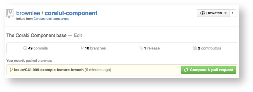
Once you are in sync and ready to issue a pull request, first publish your branch in your fork:
$ git push origin issue/CUI-999-my-feature-branch
Then, in the Githhub UI, you will see a button allowing you to 'Compare & Pull Request' your branch. Do that.
The next form shows you what is about to happen. You can browse your changes for a sanity check. You should be sure the PR comment includes the CUI-XXX number, and if you copy and paste a link to the JIRA issue you get a gold star.
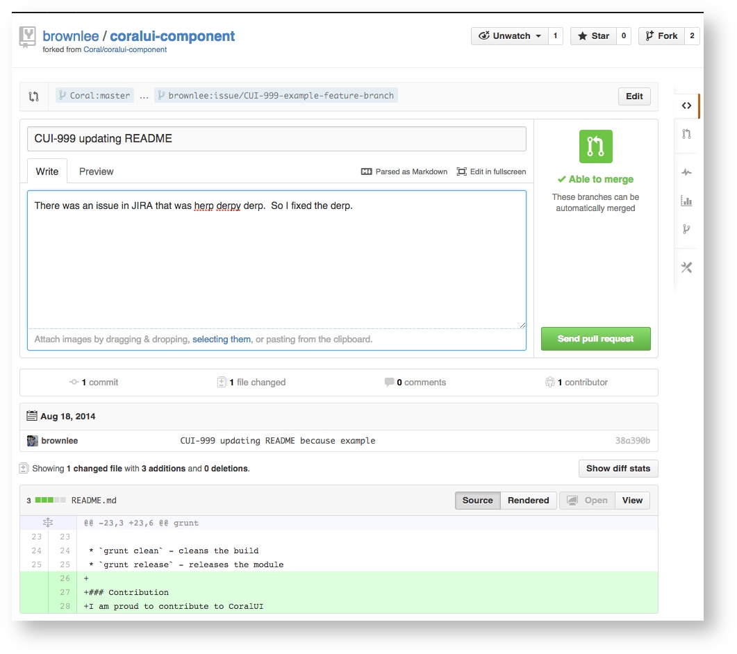
Once ready, be sure you are pull requesting to 'Coral:master' from 'you:your-branch-name'
Example:
Coral:master ... shantanu:issue/CUI-999-my-feature-branch
Hit 'Submit Pull Request' and your pull request will be created. Grab the URL of your pull request, and email that URL, with a brief description of what you're doing, and maybe the link to the JIRA issue, to the CoralUI email list. This will start your peer review.
Peer Review
Once you have submitted a pull request, you should share the URL of the pull request on DL-CoralUI-dev (CoralUI-dev@adobe.com). The CoralUI developer community will review you code for Definition of Done, and likely make suggestions on how to improve your code. This discussion will take place in the comments of the pull request. When changes are decided, you should add those improvements to your branch, and push the new commits. They will show up in the pull request automatically.
In some cases minor work may receive only "+1" as a comment, which just indicates the code was reviewed and no changes were needed. CoralUI also observes 'lazy consent' in code review. If you code receives no comments, please remind the community you are awaiting review, but you can assume that no comment means reviewers didn't find anything that needs improving. After a reasonable review period (typically a few days) the pull request will be merged unless there is obviously outstanding work still in progress.
For committers, a 4 day wait is enough to merge your own pull request with lazy consent. Please send a second notice to your thread on DL-CoralUI-dev (CoralUI-dev@adobe.com) to tell people you are closing a pull request with no comments, in case people want to check out the code after the fact.
When review is done, the pull request will be merged. You can then delete the branch in your fork and start on something new. You should also close any related JIRA issues, including a comment that references the closed pull request. You can leave the issues assigned to yourself.