Style a UXP interface
Use stylesheets for reusable presentation, inline declarations for isolated values, and JavaScript when a style depends on runtime state. UXP follows familiar web patterns but supports a defined subset of browser CSS.
data-src=../_shared/prerequisites.md
Choose a styling method
The following example compares CSS classes, inline styles, and JavaScript-assigned styles. Prefer classes for most interface styling because they keep presentation separate and are easier to update for host themes.
data-slots=heading, code
data-repeat=3
data-languages=HTML, JavaScript, CSS
index.html
<!-- 1. Using CSS classes -->
<div class="green-background">
  <h1>Styled with CSS class</h1>
</div>

<!-- 2. Using inline styles -->
<div style="background-color: yellow;">
  <h1>Styled inline</h1>
</div>

<!-- 3. Using JavaScript -->
<div id="exampleDiv">
  <h1>Styled with JavaScript</h1>
</div>
index.js
// Apply styles via JavaScript
const exampleDiv = document.getElementById("exampleDiv");
exampleDiv.style.backgroundColor = "orange";
styles.css
/* Define styles in a stylesheet */
.green-background {
  background-color: green;
}
Respond to the host theme
In Premiere, document.theme.getCurrent() returns the active "light", "dark", or "darkest" theme. The document.theme.onUpdated event runs when the user changes it.
Apply the current theme when the plugin loads, then update the interface from the event listener.
Update individual styles
data-slots=heading, code
data-repeat=2
data-languages=HTML, JavaScript
index.html
<body>
  <h4 id="plugin-heading">Application Info</h4>
  <div class="main-div">
    <div id="plugin-body"> </div>
  </div>
  <footer>
    <button id="btnPopulate">Populate Application Info</button>
    <button id="clear-btn">Clear Application Info</button>
  </footer>
</body>
index.js
function updateTheme(theme) {
  const panelBody = document.getElementById("plugin-body");
  const panelHeading = document.getElementById("plugin-heading");

  if (theme.includes("dark")) {
    panelBody.style.color = "#fff";
    panelHeading.style.color = "#fff";
  } else {
    panelBody.style.color = "#000";
    panelHeading.style.color = "#000";
  }
}

// Listen for theme changes
document.theme.onUpdated.addListener((theme) => {
  updateTheme(theme);
});

// Apply initial theme on load
const currentTheme = document.theme.getCurrent();
updateTheme(currentTheme);
Switch theme classes
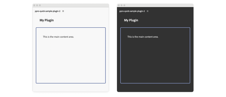
For interfaces with many themed values, apply one class to body and define colors as CSS custom properties. Changing the class updates every declaration that uses those properties.
The example defines --heading-color, --body-color, and --border-color for light and dark themes, then references them throughout the stylesheet.
data-slots=heading, code
data-repeat=3
data-languages=HTML, JavaScript, CSS
index.html
<body>
  <sp-heading>My Plugin</sp-heading>
  <div class="plugin-body">
    <sp-body>This is the main content area.</sp-body>
  </div>
</body>
index.js
function updateTheme(theme) {
  document.body.classList.remove("theme-light", "theme-dark");
  document.body.classList.add(
    theme.includes("dark") ? "theme-dark" : "theme-light"
  );
}

// Listen for theme changes
document.theme.onUpdated.addListener((theme) => {
  updateTheme(theme);
});

// Apply initial theme on load
const currentTheme = document.theme.getCurrent();
updateTheme(currentTheme);
styles.css
/* Theme CSS Variables */
body.theme-light {
  --heading-color: #2c2c2c;
  --body-color: #4a4a4a;
  --border-color: #40548e;
}

body.theme-dark {
  --heading-color: #f5f5f5;
  --body-color: #e0e0e0;
  --border-color: #97ace6;
}

body {
  padding: 0 16px;
}

.plugin-body {
  margin-top: 5px;
  padding: 16px;
  overflow: scroll;
  height: 300px;
  border-radius: 4px;
  border: 2px solid var(--border-color);
}

sp-heading {
  padding: 16px 20px;
  margin: 0 0 12px 0;
  font-size: 18px;
  color: var(--heading-color);
}

sp-body {
  padding: 20px;
  margin: 0;
  line-height: 1.6;
  font-size: 14px;
  color: var(--body-color);
}
Check host-provided CSS variables
Some Creative Cloud hosts provide built-in variables such as --uxp-host-text-color. These variables are not currently supported in Premiere, so use explicit theme classes there and check the target host's documentation before relying on host variables.
Account for UXP constraints
data-variant=warning
data-slots=heading, text
Compile preprocessors
UXP only understands standard CSS. If you want to use preprocessors like Sass or SCSS, you must transpile them to CSS before bundling your plugin. This requires build tools like Webpack and a slightly different debugging workflow.
Prefer Spectrum components
Use Spectrum components where they meet the interface requirement. They provide controls designed to align with Adobe application interfaces.