Add modal dialogs
Use a modal dialog when your plugin needs a focused response before the user returns to the host application. Dialogs work well for confirmations, short forms, settings, and command interfaces that do not need a persistent panel.
A modal dialog blocks interaction with the host until it closes. For workflows that should remain available while the user continues working, use a panel instead.
This guide starts with a dialog opened from a panel, then covers returned values, command interfaces, external HTML, and a reusable pattern for more complex dialogs.
How modal dialogs work
A UXP modal dialog is an HTML <dialog> element displayed with uxpShowModal(). The method returns a Promise that resolves when the dialog closes. Pass a value to dialog.close() when the caller needs to know how the user dismissed the dialog.
You can open a dialog from either type of entrypoint:
- Panel: Keep the dialog in the panel's HTML document and open it from a control such as a button.
- Command: Create or load the dialog when the command runs.
Open a dialog from a panel
Add a <dialog> element to the panel's HTML, then call uxpShowModal() in response to a user action. The dialog remains hidden until the method runs.
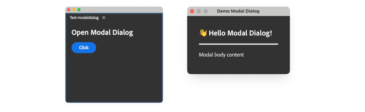
The following example opens a dialog when the user selects a button in the main panel.
data-slots=heading, code
data-repeat=2
data-languages=HTML, JavaScript
index.html
<!DOCTYPE html>
<html>
<head>
  <script src="main.js"></script>
  <link rel="stylesheet" href="style.css" />
</head>
<body>
  <!-- Panel content -->
  <sp-heading>Open Modal Dialog</sp-heading>
  <sp-button id="openDialogBtn">Click</sp-button>

  <!-- Modal dialog content (hidden by default) -->
  <dialog>
    <sp-heading>Hello Modal Dialog!</sp-heading>
    <sp-divider size="L"></sp-divider>
    <sp-body>Modal body content</sp-body>
  </dialog>

</body>
</html>
main.js
const openDialogBtn = document.getElementById("openDialogBtn");
openDialogBtn.addEventListener("click", () => {
  const dialog = document.querySelector("dialog");
  dialog.uxpShowModal({
    title: "Demo Modal Dialog",
    resize: "none",
    size: { width: 300, height: 300 },
  });
});
Configure size and behavior
Pass an options object to uxpShowModal() to control the title, dimensions, and resize behavior:
"show" | "none""none" | "both" | "horizontal" | "vertical"{ width: number; height: number; }{ width: number; height: number; }{ width: number; height: number; }Open multiple or chained dialogs
One document can contain multiple <dialog> elements. Give each dialog a unique id, then select and open it independently with uxpShowModal().
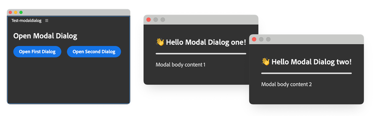
Because the dialogs are modal, users can interact with only the active dialog.
data-slots=heading, code
data-repeat=2
data-languages=HTML, JavaScript
index.html
<!DOCTYPE html>
<html>
<head>
  <script src="main.js"></script>
  <link rel="stylesheet" href="style.css" />
</head>
<body>

  <sp-heading>Open Modal Dialog</sp-heading>
  <sp-button-group>
    <sp-button id="openFirstDialogBtn">Open First Dialog</sp-button>
    <sp-button id="openSecondDialogBtn">Open Second Dialog</sp-button>
  </sp-button-group>

  <!-- First modal -->
  <dialog id="modal1">
    <sp-heading>Hello Modal Dialog!</sp-heading>
    <sp-divider size="L"></sp-divider>
    <sp-body>Modal body content 1</sp-body>
  </dialog>

  <!-- Second modal -->
  <dialog id="modal2">
    <sp-heading>Hello Another Modal Dialog!</sp-heading>
    <sp-divider size="L"></sp-divider>
    <sp-body>Modal body content 2</sp-body>
  </dialog>

</body>
</html>
main.js
const modal1 = document.getElementById("modal1");
const modal2 = document.getElementById("modal2");

document.querySelector("#openFirstDialogBtn")
  .addEventListener("click", () => {
    modal1.uxpShowModal({ /* ... options ... */ });
  });

document.querySelector("#openSecondDialogBtn")
  .addEventListener("click", () => {
    modal2.uxpShowModal({ /* ... options ... */ });
});
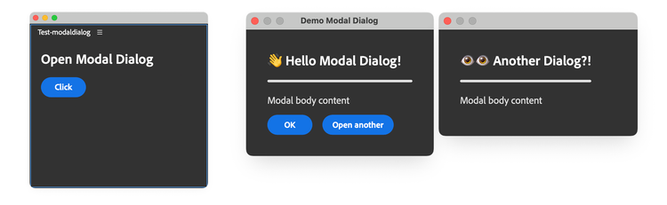
You can also open one modal dialog from another. Add the trigger and event handler to the first dialog, then call uxpShowModal() on the second. Both dialogs remain open, but the first stays blocked until the second closes.
Return a result when the dialog closes
Call close() on the dialog element to dismiss it programmatically. Pass an optional value to tell the caller which action the user took.
The following example returns "ok" or "cancel" from two dialog buttons:
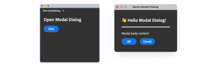
Make the handler that opens the dialog asynchronous, then use await when calling uxpShowModal(). The Promise resolves with the value passed to close().
data-slots=heading, code
data-repeat=2
data-languages=HTML, JavaScript
index.html
<!DOCTYPE html>
<html>
<head>
  <script src="main.js"></script>
  <link rel="stylesheet" href="style.css" />
</head>

<body>
  <sp-heading>Open Modal Dialog</sp-heading>
  <sp-button id="openDialogBtn">Click</sp-button>

  <dialog>
    <sp-heading>Hello Modal Dialog!</sp-heading>
    <sp-divider size="L"></sp-divider>
    <sp-body>Modal body content</sp-body>
    <sp-button-group>
      <sp-button id="closeDialogBtn">OK</sp-button>
      <sp-button id="cancelDialogBtn">Cancel</sp-button>
    </sp-button-group>
  </dialog>

</body>
</html>
main.js
const dialog = document.querySelector("dialog");

dialog?.querySelector("#closeDialogBtn")
  ?.addEventListener("click", () => {
    dialog.close("ok");
  });
dialog?.querySelector("#cancelDialogBtn")
  ?.addEventListener("click", () => {
    dialog.close("cancel");
  });

document
  .querySelector("#openDialogBtn")
  ?.addEventListener("click", async () => {
    const result = await dialog?.uxpShowModal({
      title: "Demo Modal Dialog",
      resize: "none",
      size: { width: 300, height: 300 },
    });
    console.log("Dialog closed with:", result);
  });
data-variant=warning
data-slots=heading, text
uxpShowModal() resolves with "reasonCanceled". Handle this value alongside your explicit cancel action.Open a dialog from a command
Use a modal dialog when a command needs more interface than alert(), prompt(), or confirm() can provide. The following example creates an About dialog when its command runs.
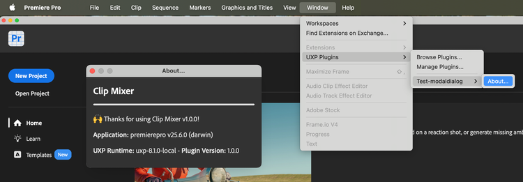
Create an About dialog
data-slots=heading, code
data-repeat=2
data-languages=JavaScript, JSON
main.js
const { entrypoints, host, versions } = require("uxp");
const manifest = require("./manifest.json");
const os = require("os");

entrypoints.setup({
  commands: {
    "about-command": async () => {
      // Create the dialog dynamically (or load from an HTML file)
      const dialog = document.createElement("dialog");
      dialog.innerHTML = `
        <sp-heading>Clip Mixer</sp-heading>
        <sp-divider size="L"></sp-divider>
        <sp-body>Thanks for using Clip Mixer v${manifest.version}!</sp-body>
        <sp-body><b>Application:</b> ${host.name} v${
        host.version
      } (${os.platform()})</sp-body>
        <sp-body><b>UXP Runtime:</b> ${versions.uxp} - <b>Plugin Version:</b> ${
        versions.plugin
      }</sp-body>
      `.trim();
      // trim is a safety measure to avoid whitespace issues

      document.body.appendChild(dialog);

      // Add styles programmatically using element.style
      dialog.style.color = "white";
      dialog.style.padding = "16px";
      dialog.querySelector("sp-divider").style.margin = "0 0 16px 0";
      dialog.querySelector("sp-heading").style.margin = "0 0 16px 0";

      // Show modal
      await dialog.uxpShowModal({
        title: "Command Modal Dialog",
        resize: "none",
        size: { width: 300, height: 200 },
      });
    },
  },
});
manifest.json
{
  "id": "Test-modaldialog",
  "name": "Test-modaldialog",
  "version": "1.0.0",
  "main": "main.js",
  "host": { "app": "premierepro", "minVersion": "25.6.0" },
  "manifestVersion": 5,
  "entrypoints": [
    {
      "id": "about-command",
      "type": "command",
      "label": "About..."
    }
  ]
}
The about-command ID appears in both manifest.json and entrypoints.setup(). The command handler creates the <dialog>, adds it to the document, and opens it. See Panels and Commands for the entrypoint model and Add Commands for more command examples.
This example builds the entire interface in JavaScript. For larger dialogs, move the markup and styles into separate files as shown in the next section.
data-variant=info
data-slots=heading, text
trim() before assigning a template literal to dialog.innerHTML. Leading or trailing whitespace can create text nodes that add unexpected space around the dialog content.Load dialog markup from an external file
For a larger interface, store the dialog markup in its own HTML file. Load it with fetch(), read the response as text, and assign the result to dialog.innerHTML:
data-slots=heading, code
data-repeat=2
data-languages=JavaScript, HTML
main.js
const { entrypoints, host, versions } = require("uxp");
const manifest = require("./manifest.json");
const os = require("os");

entrypoints.setup({
  commands: {
    "about-command": async () => {
      const dialogHtml = await fetch("./_dialog.html")
        .then((response) => response.text());
      const dialog = document.createElement("dialog");
      dialog.innerHTML = dialogHtml.trim();
      // ...
      // Replace placeholders with current values.
      dialog.querySelector("#version").textContent = manifest.version;
      dialog.querySelector("#app-name").textContent = host.name;
      dialog.querySelector("#app-version").textContent = host.version;
      dialog.querySelector("#platform").textContent = os.platform();
      dialog.querySelector("#uxp-version").textContent = versions.uxp;
      dialog.querySelector("#plugin-version").textContent = versions.plugin;
      // ...
      document.body.appendChild(dialog);
      // ...
      const result = await dialog.uxpShowModal({ /* ... */ });
    }
  }
});
_dialog.html
<sp-heading>Clip Mixer</sp-heading>
<sp-divider size="L"></sp-divider>
<sp-body>Thanks for using Clip Mixer v<span id="version"></span>!</sp-body>
<sp-body><b>Application:</b> <span id="app-name"></span> v<span id="app-version"></span> (<span id="platform"></span>)</sp-body>
<sp-body><b>UXP Runtime:</b> <span id="uxp-version"></span> - <b>Plugin Version:</b> <span id="plugin-version"></span></sp-body>
The manifest.json file is unchanged from the previous example.
Unlike a template literal, an external HTML file cannot interpolate JavaScript values directly. Add placeholders to the markup, select them after loading the file, and set their content programmatically.
Keep the manifest's "main" property set to "main.js". The external HTML file supplies dialog content; it does not become the plugin entrypoint.
data-variant=info
data-slots=heading, text, text2
require() for local .js and .json files, such as the manifest imported by the About dialog example.fetch() or the fs APIs for other local file formats.Reuse a complex dialog
If a plugin opens the same complex dialog repeatedly, encapsulate it in a class that creates the DOM once and reuses it. A singleton can keep dialog creation, initialization, result handling, and host-specific work separate while preventing duplicate elements and event listeners.
The following outline defines one reusable ModalDialog instance:
class ModalDialog {
  static #instance;

  #dialog;
  #params;

  constructor() {
    if (ModalDialog.#instance) return ModalDialog.#instance;
    ModalDialog.#instance = this;
  }

  static getInstance() {
    if (!ModalDialog.#instance) ModalDialog.#instance = new ModalDialog();
    return ModalDialog.#instance;
  }

  async createDialog() { /* ... */ }
  initDialog() { /* ... */ }
  async runDialog() { /* ... */ }
  async #runRoutine() { /* ... */ }
}

try {
  const modalDialog = ModalDialog.getInstance();
  await modalDialog.createDialog();
  modalDialog.initDialog();
  await modalDialog.runDialog();
} catch (error) {
  console.error("Unable to run dialog:", error);
}
The class separates the dialog lifecycle into these responsibilities:
static #instance#dialog<dialog> element used internally.#paramsconstructor()static getInstance()async createDialog()#dialog.initDialog()async runDialog()async #runRoutine()Build a complete reusable dialog
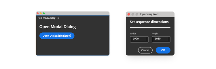
The following panel opens a reusable dialog that collects width and height values for a sequence. The host-specific operation is represented by a placeholder so the example can focus on dialog structure and validation.
.
|-- fragments/
|   |-- dialog.html
|   `-- styles.css
|-- index.html
|-- style.css
|-- main.js
`-- manifest.json
The fragments directory keeps dialog markup and styles separate from the main panel files.
data-slots=heading, code
data-repeat=6
data-languages=HTML, CSS, JavaScript, HTML, CSS, JSON
index.html
<!DOCTYPE html>
<html>
<head>
  <script src="main.js"></script>
  <link rel="stylesheet" href="style.css" />
</head>

<body>
  <sp-heading>Open Modal Dialog</sp-heading>
  <sp-button id="openDialogBtn">Open Dialog (singleton)</sp-button>
</body>
</html>
style.css
body { color: white; padding: 16px; }

sp-divider, sp-heading { margin: 0 0 16px 0; }
main.js
const DIALOG_CONFIG = {
  version: "1.0.0",
  title: "Input required...",
  dialogSize: { width: 240, height: 150 },
  defaultValues: { width: 1920, height: 1080 },
  valueRange: { min: 320, max: 10240 },
};

class ModalDialog {
  static #instance; // Singleton instance
  #dialog;          // Reference to the dialog element
  // State container for validated values
  #params = { width: 0, height: 0 };

  constructor() {
    // Enforce singleton pattern
    if (ModalDialog.#instance) { return ModalDialog.#instance; }
    ModalDialog.#instance = this;
  }

  // Static getter for singleton instance (optional, cleaner API)
  static getInstance() {
    if (!ModalDialog.#instance) {
      ModalDialog.#instance = new ModalDialog();
    }
    return ModalDialog.#instance;
  }

  // Create and populate a dialog w/ HTML elements
  // Assign to #dialog
  // Uses the same pattern as styles: create once, reuse thereafter
  async createDialog() {
    // Add scoped styles to the head
    // The conditional check ensures the styles are added only once
    // to avoid duplicates when the dialog is opened multiple times
    if (!document.querySelector("#modal-dialog-styles")) {
      const styleEl = document.createElement("style");
      styleEl.id = "modal-dialog-styles";
      styleEl.textContent = (
        await fetch("./fragments/styles.css").then((res) => res.text())
      ).trim();
      document.head.appendChild(styleEl);
    }

    // Same pattern for the dialog: create once, reuse thereafter
    if (!document.querySelector("#modal-dialog")) {
      this.#dialog = document.createElement("dialog");
      this.#dialog.id = "modal-dialog";
      // Add unique class for scoping the CSS
      this.#dialog.classList.add("modal-dialog");
      this.#dialog.innerHTML = (
        await fetch("./fragments/dialog.html").then((res) => res.text())
      ).trim();
      document.body.appendChild(this.#dialog);
    } else {
      // Reuse existing dialog
      this.#dialog = document.querySelector("#modal-dialog");
    }
  }

  initDialog() {
    const widthField = this.#dialog.querySelector("#width");
    const heightField = this.#dialog.querySelector("#height");

    // Reset to the default values each time the dialog opens.
    widthField.value = DIALOG_CONFIG.defaultValues.width.toString();
    heightField.value = DIALOG_CONFIG.defaultValues.height.toString();

    // Attach event listeners only once because the dialog is reused.
    if (!this.#dialog.dataset.listenersAttached) {
      // Sanitize input for the textfields
      const sanitizeInput = (evt) => {
        /* ... */
      };
      widthField.addEventListener("input", sanitizeInput);
      heightField.addEventListener("input", sanitizeInput);

      // Validate and return params object if valid, null if invalid
      const validateAndGetParams = () => {
        const width = parseInt(widthField.value, 10);
        const height = parseInt(heightField.value, 10);
        if (
          Number.isNaN(width) || Number.isNaN(height) ||
          width < DIALOG_CONFIG.valueRange.min ||
          width > DIALOG_CONFIG.valueRange.max ||
          height < DIALOG_CONFIG.valueRange.min ||
          height > DIALOG_CONFIG.valueRange.max
        ) {
          return null;
        }
        return { width, height };
      };

      this.#dialog
        .querySelector("#okDialogBtn")
        .addEventListener("click", () => {
          const params = validateAndGetParams();
          if (params) {
            // Store validated params for use in #runRoutine
            this.#params = params;
            this.#dialog.close("ok");
          } else {
            // alert the user that the parameters are invalid
            alert("Invalid parameters");
          }
        });
      this.#dialog
        .querySelector("#cancelDialogBtn")
        .addEventListener("click", () => {
          this.#dialog.close("cancel");
        });

      this.#dialog.addEventListener("keydown", (event) => {
        if (event.key === "Enter") {
          const params = validateAndGetParams();
          if (params) {
            this.#params = params;
            this.#dialog.close("ok");
          }
        }
      });

      // Mark the dialog element itself as having listeners attached
      this.#dialog.dataset.listenersAttached = "true";
    }
  }

  async runDialog() {
    const result = await this.#dialog.uxpShowModal({
      title: DIALOG_CONFIG.title,
      resize: "none",
      size: DIALOG_CONFIG.dialogSize,
    });

    if (result === "ok") {
      console.log("Dialog closed with OK");
      const completed = await this.#runRoutine();
      if (!completed) throw new Error("Dialog routine failed");
      return true;
    }

    if (result === "cancel" || result === "reasonCanceled") {
      return false;
    }

    throw new Error(`Unexpected dialog result: ${result}`);
  }

  // Run whatever Host App DOM code is needed
  // Has access to validated params via this.#params
  async #runRoutine() {
    console.log("Running PPro routine with params:", this.#params);
    //... perform the (fictitious) routine using
    // this.#params.width and this.#params.height
    return true;
  }

  // Getter to access validated params (if needed by external code)
  getParams() {
    // Return a copy to prevent external mutation
    return { ...this.#params };
  }
}

const openDialogButton = document.querySelector("#openDialogBtn");
if (openDialogButton && !openDialogButton.dataset.listenerAttached) {
  openDialogButton.addEventListener("click", async () => {
    try {
      const modalDialog = ModalDialog.getInstance();
      await modalDialog.createDialog();
      modalDialog.initDialog();
      await modalDialog.runDialog();
    } catch (error) {
      console.error("Unable to run dialog:", error);
    }
  });
  openDialogButton.dataset.listenerAttached = "true";
}
fragments/dialog.html
<div class="wrapper">
  <sp-heading size="S">Set sequence dimensions</sp-heading>
  <sp-divider size="L"></sp-divider>
  <div class="row spaced">
    <sp-textfield id="width" type="number">
      <sp-label slot="label">Width</sp-label>
    </sp-textfield>
    <sp-textfield id="height" type="number">
      <sp-label slot="label">Height</sp-label>
    </sp-textfield>
  </div>
  <sp-button-group>
    <sp-button variant="secondary" id="cancelDialogBtn">
      Cancel
    </sp-button>
    <sp-button variant="cta" id="okDialogBtn">
      OK
    </sp-button>
  </sp-button-group>
</div>
fragments/styles.css
/* Everything is scoped for the modal dialog only */
dialog.modal-dialog { padding: 0; }

dialog.modal-dialog .wrapper {
  min-height: 100vh; overflow: hidden;
  padding: 10px 20px; display: flex; flex-direction: column;
}

dialog.modal-dialog .row {
  display: flex; flex-direction: row; justify-content: space-between;
}

dialog.modal-dialog .spaced { margin-bottom: 16px; }

dialog.modal-dialog sp-textfield {
  display: flex; width: 92px; margin-bottom: 6px;
}

dialog.modal-dialog sp-button-group {
  display: flex; flex-direction: row; justify-content: flex-end;
}
manifest.json
{
  "id": "Test-modaldialog",
  "name": "Test-modaldialog",
  "version": "1.0.0",
  "main": "index.html",
  "host": { "app": "premierepro", "minVersion": "25.6.0" },
  "manifestVersion": 5,
  "requiredPermissions": { "localFileSystem": "request" },
  "featureFlags": { "enableAlerts": true },
  "entrypoints": [
    {
      "id": "starterpanel",
      "type": "panel",
      "minimumSize": { "width": 430, "height": 500 },
      "maximumSize": { "width": 2000, "height": 2000 },
      "preferredDockedSize": { "width": 230, "height": 300 },
      "preferredFloatingSize": { "width": 400, "height": 300 },
      "label": { "default": "PremierePro Modal Dialog" },
      "icons": [
        {
          "width": 23, "height": 23, "path": "icons/dark.png",
          "scale": [ 1, 2 ], "theme": [ "darkest", "dark", "medium" ]
        },
        {
          "width": 23, "height": 23, "path": "icons/light.png",
          "scale": [ 1, 2 ], "theme": [ "lightest", "light" ]
        }
      ]
    }
  ],
  "icons": [
    {
      "width": 48, "height": 48, "path": "icons/plugin-icon.png",
      "theme": [
        "darkest", "dark", "medium", "lightest", "light", "all"
      ],
      "species": [ "pluginList" ], "scale": [ 1, 2 ]
    }
  ]
}
How the example is organized
The example separates the main panel, dialog fragments, and dialog behavior so each part has one responsibility.
Panel and manifest
index.html and style.css define the panel that opens the dialog. The manifest declares the panel entrypoint and enables alert(), which reports invalid input.
Dialog markup and styles
fragments/dialog.html contains the fields and buttons. Its outer <div> provides the content for the <dialog> element created in main.js. The selectors in fragments/styles.css begin with dialog.modal-dialog so they do not affect the main panel.
Dialog behavior
main.js divides the lifecycle across focused methods:
createDialog()loads the fragments and creates the dialog only once.initDialog()resets field values and attaches event listeners only once.runDialog()opens the dialog, handles its result, and runs the operation after a valid confirmation.#runRoutine()contains the host-specific work that uses the validated values.getParams()returns a copy of the collected values without exposing private state.
The button handler retrieves the singleton, creates the dialog if necessary, initializes its state, and opens it. A normal cancellation returns false; unexpected failures are reported through the catch block.