Building UIs using Adobe's Spectrum Design System
This tutorial will guide you on how to get started building great UI's for your add-ons using Adobe Spectrum.
This tutorial was also presented in a recorded workshop that can be viewed here.
Introduction
In this tutorial, you will learn how to build two fully functioning Adobe Express add-ons from scratch that use Adobe Spectrum for building the user interface. The concept for the add-on you will build is a bingo card generator, which allows a user to customize a bingo card with their chosen colors, random numbers and an optional FREE space.
The two different add-on's you will create are:
A basic JavaScript add-on that uses Spectrum Web Components to build out the UI.
A React-based add-on that uses the
swc-reactSpectrum Web Components wrapper library.
An example of what you will build is shown below:

This add-on allows users to select settings to customize a bingo card; including background, foreground, title color, gridline size and whether to include a "FREE" space. The card is generated with random numbers, and ensures no numbers are used twice. The user can drag the customized card to the page, or click the "Add to page" button to use it in their document.
Changelog
February 6th, 2024
- Updated tips on Spectrum CSS styling to add additional details on why you should use Spectrum CSS variables to style your add-ons, and additional helpful guidelines for locating and using them
January 31st, 2024
- First publication, by Holly Schinsky
Prerequisites
- Familiarity with HTML, CSS, JavaScript.
- Familiarity with the Adobe Express add-ons environment; if you need a refresher, follow the quickstart guide.
- An Adobe Express account; use your existing Adobe ID or create one for free.
- Node.js version 16 or newer.
Sample Projects
- Lesson 1 project - Bingo Card Generator add-on using Spectrum Web Components and JavaScript
- Lesson 2 project - Bingo Card Generator add-on using swc-react and ReactJS
Topics Covered
Quickstart: Try Spectrum Web Components
A quick way to try out Spectrum Web Components without requiring any external tools, is to use a sandboxed environment like a codepen. See this simple codepen, for example. It references the Spectrum Web Components libraries as bundles from a CDN for simplicity, and shows how to use the Express theme with a button component.
Check out the codepen, then try changing the scale value in the <sp-theme> tag to a value of "large" - then back to "medium" to see the effect.
NOTE: You can try using any other Spectrum Web Components in a similar fashion, ensuring they're included within the opening <sp-theme> and closing </sp-theme> tags.
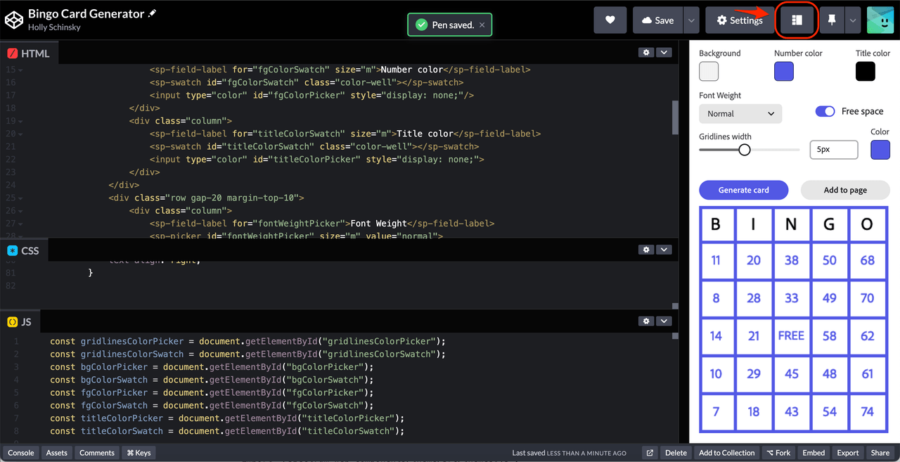
Before moving on, check out this codepen which implements the UI for the bingo card generator add-on and gives you a glimpse of what you're going to be building. You can change the layout to represent how it might look running in Express, by clicking the layout icon button outlined below, and dragging the width of the frame to 320px:

CDN URL references are used to show you a quick way to get started with Spectrum Web Components. However, you will notice the UI is laggy, so you wouldn't want to use this for your final add-on projects for performance reasons. In the following lessons, you will learn how to configure your projects to use only the modules and components your UI needs to ensure the best performance for your add-ons.
FAQ
Q: What's the difference between Spectrum Web Components and swc-react?
A: Spectrum Web Components are native web components that work with vanilla JavaScript, while swc-react provides React wrapper components for the same Spectrum Web Components. Use Spectrum Web Components for basic JavaScript projects and swc-react for React-based add-ons.
Q: Which approach should I choose for my add-on?
A: Choose based on your preferred development approach:
- Lesson 1 (Spectrum Web Components): If you prefer vanilla JavaScript or want to avoid React
- Lesson 2 (swc-react): If you're comfortable with React and want modern component patterns
Both approaches create the same bingo card generator add-on with identical functionality.
Q: Do I need to know React to follow this tutorial?
A: No! Lesson 1 uses only vanilla JavaScript with Spectrum Web Components. Lesson 2 covers React with swc-react, but includes explanations of React concepts as needed.
Q: What are the prerequisites for this tutorial?
A: You'll need:
- Familiarity with HTML, CSS, and JavaScript
- Basic understanding of Adobe Express add-ons (complete the quickstart guide first)
- Node.js version 16 or newer
- An Adobe Express account
Q: Can I use both approaches in the same add-on?
A: No, you should choose one approach per add-on. Mixing Spectrum Web Components and swc-react in the same project can lead to conflicts and is not recommended.

