Lesson 1: Use Spectrum Web Components in a basic JavaScript add-on
Configure and use Spectrum Web Components in a basic JavaScript add-on.
Introduction
There are a few open source Spectrum libraries available, but we specifically recommend using the Spectrum Web Components library, as it offers a comprehensive set of UI components with built-in benefits for developers, including:
- A built-in Express theme
- Accessibility
- Lightweight and performant
- Time savings due to the built-in styling
- Compliant with industry standards
Steps
Create and configure your add-on
Use the CLI to create a new add-on based on the basic javascript template:
Copied to your clipboardnpx @adobe/create-ccweb-add-on bingo-card-generator-js --template javascript
If you've used the CLI prior to this, you may want to run this command to ensure you have the most up-to-date version before creating your project --> npx clear-npx-cache
NOTE: You could use the CDN URL's (https://jspm.dev/@spectrum-web-components/bundle/elements.js) once again to get started quickly, but since you'll want to ensure your add-on projects are performant, you will learn how to configure your local add-on project to use the specific Spectrum Web Components you'll need, instead.
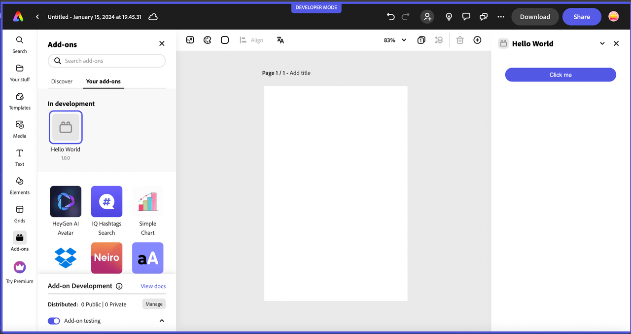
If you run the project at this point (npm run build; npm run start), you will see a basic button displayed in the UI with custom CSS set to style it for Express, as shown below:

However, since you're going to be implementing a whole new UI, go ahead and remove the existing lines related to the button:
Open the src/index.html file and remove the following lines within the <body> block:
Copied to your clipboard<div class="container"><button id="clickMe" disabled>Click me</button></div>
you should also remove the associated CSS styles from the <style> block since they are no longer needed:
Copied to your clipboard.container {margin: 24px;display: flex;flex-direction: column;}button {background-color: rgb(82, 88, 228);border-color: rgb(82, 88, 228);border-radius: 16px;border-style: solid;color: rgb(255, 255, 255);font-family: sans-serif;height: 32px;}button:disabled {background-color: rgb(177, 177, 177);border-color: rgb(177, 177, 177);}button:not([disabled]):hover {background-color: rgb(64, 70, 202);cursor: pointer;}
Then, open the src/index.js and remove the following lines, (ensuring you keep the addOnUISdk.ready.then(() => {...} block intact).
Copied to your clipboardconst clickMeButton = document.getElementById("clickMe");clickMeButton.addEventListener("click", () => {clickMeButton.innerHTML = "Clicked";});// Enable the button only when:// 1. `addOnUISdk` is ready, and// 2. `click` event listener is registered.clickMeButton.disabled = false;
Next, you're going to need to configure your new add-on project to use webpack, since it's required to bundle the Spectrum Web Components properly. This requires a webpack.config.js file and some additional updates to your package.json:
First, create a new file named
webpack.config.jsin the root of your add-on project, (outside thesrc), and copy in the code block below (or, alternatively, copy it in from the provided project):Copied to your clipboardconst path = require("path");const HtmlWebpackPlugin = require("html-webpack-plugin");const CopyWebpackPlugin = require("copy-webpack-plugin");const isEnvProduction = process.env.NODE_ENV === "production";module.exports = {mode: isEnvProduction ? "production" : "development",devtool: isEnvProduction ? "source-map" : "eval-source-map",entry: "./src/index.js",experiments: {outputModule: true},output: {path: path.resolve(__dirname, "dist"),module: true,filename: "index.js"},externalsType: "module",externalsPresets: { web: true },plugins: [new HtmlWebpackPlugin({template: "src/index.html",scriptLoading: "module"}),new CopyWebpackPlugin({patterns: [{ from: "src/*.json", to: "[name][ext]" },{ from: "src/*.png", to: "[name][ext]", noErrorOnMissing: true },],})],module: {rules: [{test: /\.(js)$/,exclude: /node_modules/,use: ["babel-loader"]},{test: /(\.css)$/,use: ["style-loader", "css-loader"]}]},resolve: {extensions: [".js", ".css"]}};Now, update your
package.jsonto configure it to use webpack and add the required dependencies. This requires an update to thescriptsblock to add the--use webpackparameter, as shown below:Copied to your clipboard"scripts": {"clean": "ccweb-add-on-scripts clean","build": "ccweb-add-on-scripts build --use webpack","start": "ccweb-add-on-scripts start --use webpack","package": "ccweb-add-on-scripts package --use webpack"}It will also require you to update your
devDependenciesblock with the following:Copied to your clipboard"devDependencies": {"@adobe/ccweb-add-on-scripts": "^1.2.1","@adobe/ccweb-add-on-sdk-types": "^1.2.1","@babel/core": "7.23.3","@babel/preset-env": "7.23.3","@babel/preset-react": "7.23.3","babel-loader": "9.1.3","copy-webpack-plugin": "11.0.0","css-loader": "6.8.1","html-webpack-plugin": "5.5.3","style-loader": "3.3.3","webpack": "5.89.0","webpack-cli": "5.1.4"}IMPORTANT: You will need to run
npm installto ensure all of the new dependencies are installed.
Set up the Express theme
Install and use the Spectrum Web Components
<sp-theme>component, which includes the modules that provide the overall theme for the Spectrum Web Components in your UI.npm install @spectrum-web-components/theme@1.7.0Note: if you prefer to use
yarn, you could alternatively use the command:yarn add @spectrum-web-components/theme@1.7.0.Notice your new component is now included in the
package.json.Now, open your
src/index.jsand import the specific theme and typography classes below for the Express theme, color and scale you'll want to support in your add-on:Copied to your clipboard/* Theme and typography imports */import '@spectrum-web-components/styles/typography.css';import '@spectrum-web-components/theme/express/theme-light.js';import '@spectrum-web-components/theme/express/scale-medium.js';import '@spectrum-web-components/theme/sp-theme.js';Optionally, note these theme-related imports to consider if you plan to include support for a future "dark" theme or "large" scale when add-ons are supported on mobile:
Copied to your clipboard// import '@spectrum-web-components/theme/express/theme-dark.js'; /* to support a future dark theme */// import '@spectrum-web-components/theme/express/scale-large.js'; /* future support for mobile for insance */Note: The
typography.cssimport is not required, but is useful to note for using Spectrum CSS variables to help style the typography components of your add-ons, and to provide margins.You can now add the
<sp-theme>tag to your UI, but note that you won't actually see anything visually yet, since there are no components for it to be applied to. Open yoursrc/index.htmlfile, and add the following theme component into the<body>tags, configured with amediumscale,lightcolor andexpresstheme:Copied to your clipboard<sp-theme scale="medium" color="light" system="express"><!-- UI content will go here --></sp-theme>NOTE: Express currently only supports a light theme, but support for a dark theme will be coming in the future, so you could add some code that listens for the Add-on UI SDK's
themechangeevent and apply the change to your UI with something like the following:Copied to your clipboardaddOnUISdk.app.on("themechange", (data) => {applyTheme(data.theme);});Another important thing to note, is the existence of the following block in the starter template
src/index.jsfile, which can be used to ensure the Add-on UI SDK has been fully initialized and is ready for use before trying to implement your UI. You may have also noticed that the original button in the UI was set todisabled, and is subsequently enabled in this block:Copied to your clipboardaddOnUISdk.ready.then(() => {// Enable the button only when:// 1. `addOnUISdk` is ready, and// 2. `click` event listener is registered.clickMeButton.disabled = false;}Keep note of this pattern as you develop your own add-ons.
Install Spectrum Web Components
Now you can start installing all of the Spectrum Web Components that will be used to build the UI of your add-on. These components are installed in a similar fashion to how the <sp-theme> component was added, with an npm install or yarn add command.
Copied to your clipboardnpm install @spectrum-web-components/button@1.7.0 @spectrum-web-components/button-group@1.7.0 @spectrum-web-components/field-label@1.7.0 @spectrum-web-components/menu@1.7.0 @spectrum-web-components/picker@1.7.0 @spectrum-web-components/slider@1.7.0 @spectrum-web-components/swatch@1.7.0 @spectrum-web-components/switch@1.7.0
NOTE: The above command specifies the 1.7.0 version specifically, which is the current stable version for Spectrum Web Components.
Alternatively, you could also copy in the following block below to the dependencies block of your package.json file, and then run npm install to install them all at once:
Copied to your clipboard"dependencies": {"@spectrum-web-components/button": "1.7.0","@spectrum-web-components/button-group": "1.7.0","@spectrum-web-components/field-label": "1.7.0","@spectrum-web-components/menu": "1.7.0","@spectrum-web-components/picker": "1.7.0","@spectrum-web-components/slider": "1.7.0","@spectrum-web-components/swatch": "1.7.0","@spectrum-web-components/switch": "1.7.0","@spectrum-web-components/theme": "1.7.0"}
IMPORTANT: You must ensure the versions of all of your Spectrum Web Components installed are the same, or you will see errors upon build or while running. You may want to just open your package.json file at this point to double check to ensure they all match, before moving on.
Import Spectrum Web Components
Add the following list of imports for the new components into your src/index.js file with the following block:
Copied to your clipboardimport "@spectrum-web-components/button/sp-button.js";import "@spectrum-web-components/button-group/sp-button-group.js";import "@spectrum-web-components/field-label/sp-field-label.js";import '@spectrum-web-components/menu/sp-menu.js';import '@spectrum-web-components/menu/sp-menu-item.js';import "@spectrum-web-components/number-field/sp-number-field.js";import '@spectrum-web-components/picker/sp-picker.js';import "@spectrum-web-components/slider/sp-slider.js";import "@spectrum-web-components/swatch/sp-swatch.js";import '@spectrum-web-components/switch/sp-switch.js';
Build UI with Spectrum Web Components
Next, open the src/index.html file and implement the following code for the UI components within the opening and closing <sp-theme> block, as provided below:
Copied to your clipboard<sp-theme scale="medium" color="light" system="express"><div class="row gap-20"><div class="column"><sp-field-label for="bgColorSwatch" size="m">Background color</sp-field-label><sp-swatch id="bgColorSwatch" class="color-well"></sp-swatch><input type="color" id="bgColorPicker" style="display: none;"/></div><div class="column"><sp-field-label for="fgColorSwatch" size="m">Number color</sp-field-label><sp-swatch id="fgColorSwatch" class="color-well"></sp-swatch><input type="color" id="fgColorPicker" style="display: none;"/></div><div class="column"><sp-field-label for="titleColorSwatch" size="m">Title color</sp-field-label><sp-swatch id="titleColorSwatch" class="color-well"></sp-swatch><input type="color" id="titleColorPicker" style="display: none;"></div></div><div class="row gap-20 margin-top-10"><div class="column"><sp-field-label for="fontWeightPicker">Font Weight</sp-field-label><sp-picker id="fontWeightPicker" size="m" value="normal"><sp-menu-item value="normal">Normal</sp-menu-item><sp-menu-item value="bold">Bold</sp-menu-item><sp-menu-item value="lighter">Lighter</sp-menu-item></sp-picker></div><div class="column gap-20"><sp-switch id="freeSpaceToggle" emphasized value="on" checked size="l">Free space</sp-switch></div></div><div class="row gap-20"><sp-slider label="Gridlines width" id="gridlineSize" variant="filled" editablehide-stepper min="1" max="10" value="5"format-options='{"style": "unit", "unit": "px"}' step="1"></sp-slider><div class="column"><sp-field-label for="gridlinesColorSwatch" size="m">Color</sp-field-label><sp-swatch id="gridlinesColorSwatch" class="color-well"></sp-swatch><input type="color" id="gridlinesColorPicker" style="display: none;"></div></div><div class="margin-top-10"><sp-button-group horizontal><sp-button id="generateBtn" disabled>Generate card</sp-button><sp-button id="addBtn" variant="secondary" disabled>Add to page</sp-button></sp-button-group></div><div class="margin-top-10"><canvas id="finalCard"/></div></sp-theme>
Note the properties for each, and use the Spectrum Web Component documentation to help cross-reference them for more context.
Worth mentioning, are the details around the use of the <sp-swatch> components, which are coupled with a hidden native <input> component to allow the user to pick their colors. Though SWC features a variety of color-related components (Color Area, Color Handle, Color Loupe, Color Slider), there is not an actual picker, so this add-on implements it via an <sp-swatch> for the UI and a hidden native <input> element behind it.
The <sp-swatch> click handler programmatically triggers the <input> click, which, although hidden, can still display the browser's native color picker. On input (i.e., when the user selects a different color within the picker), the color attribute of the <sp-swatch> updates as the color is changed to them in sync.
Also, be sure to check out Adobe's UX Guidelines as many of these components are included with specific guidelines, including:
<sp-number-field> for the gridsize value
<sp-slider> for the gridsize picker
<sp-swatch> for the color pickers
<sp-button-group> and <sp-button> for the CTA buttons.
Style your UI
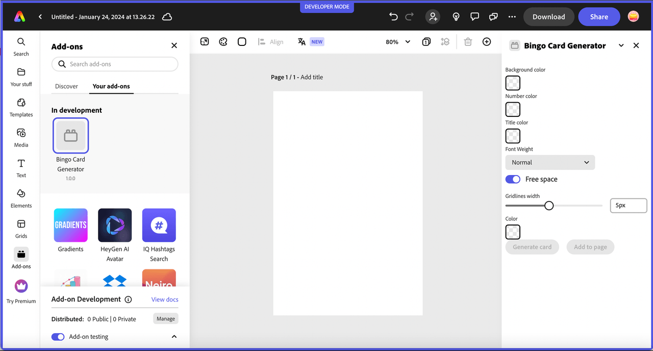
If you run your add-on project with the CLI at this point (npm run build; npm run start), you will notice that your UI layout is less than ideal, as shown below:

Even though the Spectrum Web Components themselves have styling applied, the layout of them does not. That's because the Spectrum Web Components library doesn't include any specific layout components. However, you can use Spectrum CSS variables to help you with that.
In this step you will define some styles and selectors to improve the layout and general styling of your UI. You may have noticed there were already some classes set when you copied in the code block above, but since they don't actually apply yet, you'll eed to define them in this step.
Locate the <style> block in your src/index.html, and add the following CSS selectors and classes:
Copied to your clipboardsp-theme {margin: 0 var(--spectrum-global-dimension-static-size-100);display: grid;}h2 {font-weight: var(--spectrum-global-font-weight-black);}sp-swatch {width: var(--spectrum-swatch-size-medium);}sp-button {flex: 1;max-width: calc((100% - var(--spectrum-global-dimension-static-size-250)) / 2);}sp-textfield,sp-picker {width: var(--spectrum-global-dimension-static-size-1700);display: flex;}sp-number-field {width: 100%;}sp-button-group {margin-top: var(--spectrum-global-dimension-static-size-300);width: 100%;display: flex;justify-content: space-between;}sp-slider {width: 100%;--spectrum-slider-font-size: var(--spectrum-font-size-100);}sp-field-label {font-size: var(--spectrum-global-dimension-font-size-100);}.color-well {cursor: pointer;--mod-swatch-border-thickness: var(--spectrum-divider-thickness-small);--mod-swatch-border-color: var(--spectrum-transparent-black-500);}.row {display: flex;flex-direction: row;justify-content: space-between;width: 100%;align-items: flex-end;}.column {display: flex;flex-direction: column;}.gap-20 {gap: var(--spectrum-global-dimension-static-size-250);}.margin-top-10 {margin-top: var(--spectrum-global-dimension-static-size-125);}#bingoCanvas {width: 290px;}
TIP: You can locate the custom global variables avaiable for use to adjust your UI as desired in the /node_modules/@spectrum-web-components/styles/express/spectrum-core-global.css of your project.
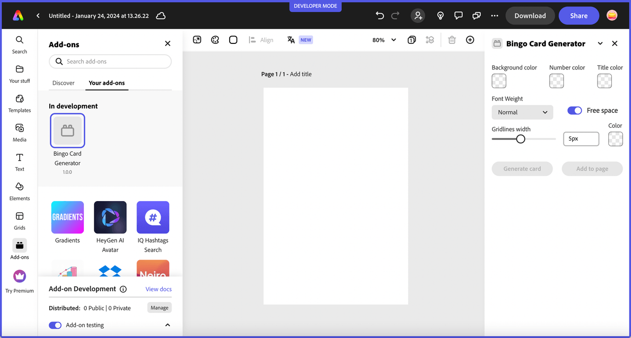
If you kept your add-on running in Express after the changes in the steps above, it should automatically refresh and you can view the updates. It should look something like this screenshot below:

Wire UI code and add canvas drawing logic
After completing the above, you will see that many of the components aren't active yet, since there's currently no associated logic applied to set values or enable the buttons. First, continue adjusting the layout as needed, then, once you're happy with it, you can start implementing the logic to set some default values for the components and enable the Generate card button to allow the user to generate their customized bingo card. Open your src/index.js and copy in the following code snippet after your imports, replacing the addOnUISdk.ready.then(() => { callback since it's included below.
Copied to your clipboard// Wait for the SDK to be readyaddOnUISdk.ready.then(() => {console.log("addOnUISdk is ready for use.");// Refs to the <sp-swatch> and <input> elements for each colorconst gridlinesColorSwatch = document.getElementById("gridlinesColorSwatch");const gridlinesColorPicker = document.getElementById("gridlinesColorPicker");const bgColorSwatch = document.getElementById("bgColorSwatch");const bgColorPicker = document.getElementById("bgColorPicker");const fgColorSwatch = document.getElementById("fgColorSwatch");const fgColorPicker = document.getElementById("fgColorPicker");const titleColorSwatch = document.getElementById("titleColorSwatch");const titleColorPicker = document.getElementById("titleColorPicker");// Initialize colors for the abovegridlinesColorPicker.value = "#5258e5"; // gridline colorgridlinesColorSwatch.color = "#5258e5"; // gridline colorbgColorPicker.value = "#f2f2f2"; // box background colorbgColorSwatch.color = "#f2f2f2"; // box background colorfgColorPicker.value = "#5258e5"; // bingo number colorfgColorSwatch.color = "#5258e5"; // bingo number colortitleColorPicker.value = "#000000"; // title colortitleColorSwatch.color = "#000000"; // title color// Trigger click on the native color pickers for eachgridlinesColorSwatch.addEventListener("click", function () {gridlinesColorPicker.click();});gridlinesColorPicker.addEventListener("input", function (event) {const selectedColor = event.target.value;gridlinesColorSwatch.setAttribute("color", selectedColor);});fgColorSwatch.addEventListener("click", function () {fgColorPicker.click();});fgColorPicker.addEventListener("input", function (event) {const selectedColor = event.target.value;fgColorSwatch.setAttribute("color", selectedColor);});bgColorSwatch.addEventListener("click", function () {bgColorPicker.click();});bgColorPicker.addEventListener("input", function (event) {const selectedColor = event.target.value;bgColorSwatch.setAttribute("color", selectedColor);});titleColorSwatch.addEventListener("click", function () {titleColorPicker.click();});titleColorPicker.addEventListener("input", function (event) {const selectedColor = event.target.value;titleColorSwatch.setAttribute("color", selectedColor);});// CTA button referencesconst generateBtn = document.getElementById("generateBtn");const addBtn = document.getElementById("addBtn");// Generate button handlergenerateBtn.onclick = async (event) => {generateBingoCard();};/* Enable the generate button now that the SDK is ready and the button event handler has been registered. The add to page button should only be enabled once a card has been generated. */generateBtn.disabled = false;});// Function to generate the bingo card using an HTML canvas and drawing contextfunction generateBingoCard() {const canvas = document.getElementById("finalCard");const ctx = canvas.getContext("2d");// Set canvas width and heightcanvas.width = 300;canvas.height = 360;// Set grid propertieslet gridlineSize = document.getElementById("gridlineSize").value;const numRows = 6;const numCols = 5;const cellWidth = 60;const cellHeight = 60;// Draw background rects with user selected colorctx.fillStyle = bgColorPicker.value;for (let x = gridlineSize/2; x <= canvas.width; x += cellWidth-gridlineSize) {for (let y = gridlineSize/2; y <= canvas.height; y += cellHeight-gridlineSize) {ctx.fillRect(x, y, cellWidth-gridlineSize, cellHeight-gridlineSize);}}// Draw gridlinesctx.lineWidth = gridlineSize;for (let i = 0; i <= numCols; i++) {// Need to adjust for left/right gridlines sizectx.moveTo(gridlineSize/2, 0);ctx.lineTo(gridlineSize/2, canvas.height);ctx.moveTo(i * cellWidth-gridlineSize/2, 0);ctx.lineTo(i * cellWidth-gridlineSize/2, canvas.height);}for (let i = 0; i <= numRows; i++) {// Need to adjust for top/bottom gridlines sizectx.moveTo(0, gridlineSize/2);ctx.lineTo(canvas.height, gridlineSize/2,);ctx.moveTo(0, i * cellWidth-gridlineSize/2);ctx.lineTo(canvas.height, i * cellWidth-gridlineSize/2);}ctx.strokeStyle = gridlinesColorPicker.value;ctx.stroke();// Draw bingo titlectx.font = fontWeightPicker.value +' 28px adobe clean';ctx.textAlign = "center";ctx.textBaseline = 'middle';ctx.fillStyle = titleColorPicker.value; //font colorlet bingoTitle = ['B','I','N','G','O'];for (let charCnt = 0; charCnt < bingoTitle.length; charCnt++) {let letter = bingoTitle[charCnt];ctx.fillText(letter, charCnt * cellWidth + cellWidth / 2 - 4, cellHeight / 2 + 8);}// Generate random numbersconst freeSpace = [3, 2]; // Coordinates of the FREE spaceconst numbers = [];const usedNumbers = new Set(); // Track used numbersctx.font = fontWeightPicker.value +' 22px adobe clean';ctx.fillStyle = fgColorPicker.value; // color of the numbersctx.textAlign = "center";const freeSpaceToggle = document.getElementById("freeSpaceToggle");for (let i = 1; i < numRows; i++) {numbers[i] = [];for (let j = 0; j < numCols; j++) {if (freeSpaceToggle.checked) {if (i === freeSpace[0] && j === freeSpace[1]) {numbers[i][j] = "FREE";continue; // Skip the FREE space}}let num;do {num = Math.floor(Math.random() * 15) + 1 + (j * 15);} while (usedNumbers.has(num)); // Generate unique numbersusedNumbers.add(num);numbers[i][j] = num;ctx.fillText(num, j * cellWidth + cellWidth / 2 - 3, i * cellHeight + cellHeight / 2 + 3);}}// Draw "FREE" if the toggle is checkedif (freeSpaceToggle.checked) {ctx.font = fontWeightPicker.value +' 20px adobe clean';ctx.fillText("FREE", freeSpace[1] * cellWidth + cellWidth / 2 - 3, freeSpace[0] * cellHeight + cellHeight / 2 + 3);ctx.drawImage(canvas, 0, 0);}// Enable drag and drop for the cardaddOnUISdk.app.enableDragToDocument(canvas, {previewCallback: el => new URL(canvas.toDataURL()),completionCallback: async el => {const r = await fetch(canvas.toDataURL());const blob = await r.blob();return [{blob}];}})// Add button click handleraddBtn.onclick = async () => {const r = await fetch(canvas.toDataURL());const blob = await r.blob();addOnUISdk.app.document.addImage(blob);}// Enable the add to page buttonaddBtn.disabled = false;}
Once you've updated your code, your add-on should reload and you can generate a custom bingo card! Try playing with some settings and see how they render in a new card. You can also try to drag your card to the page, or add it with the add button etc. If your add-on didn't pick up the changes for any reason, you can always use the add-on developer tools to do a refresh, or simply run npm run build; npm run start again.

FAQ
Q: Why do I need webpack for Spectrum Web Components?
A: Webpack is required to properly bundle Spectrum Web Components and their dependencies. The CLI's default bundler doesn't handle the complex module structure of Spectrum Web Components, so webpack ensures all components are correctly packaged and optimized for your add-on.
Q: What if I get version conflicts between Spectrum Web Components?
A: All @spectrum-web-components/* packages must use identical versions. If you see registry errors or build failures, check your package.json and ensure every Spectrum Web Component package uses the same version (like 1.7.0). Run npm install after updating versions.
Q: How do I add more Spectrum Web Components to my add-on?
A: Follow these steps:
- Install the component:
npm install @spectrum-web-components/[component-name]@1.7.0 - Import it in your JavaScript:
import "@spectrum-web-components/[component-name]/sp-[component-name].js" - Use it in your HTML within the
<sp-theme>tags - Always ensure the version matches your other Spectrum Web Components
Q: Can I use this approach with vanilla HTML/CSS instead of the CLI?
A: While possible, it's not recommended. The CLI provides essential build tools, hot reloading, and proper bundling. For simple testing, you can use CDN links (as shown in the quickstart), but production add-ons should use the CLI setup for performance and reliability.
Q: Why do I need the hidden <input> elements for color pickers?
A: Spectrum Web Components doesn't include a native color picker component. The <sp-swatch> displays the selected color, but clicking it triggers a hidden HTML <input type="color"> element to show the browser's native color picker. This pattern provides the best user experience while maintaining Spectrum's visual design.
Q: Can I customize the Spectrum Web Components styling?
A: Yes! Use Spectrum CSS variables for layout and spacing, and component modifier variables (prefixed with --mod-*) for component-specific customizations. This ensures your styling remains consistent with the Spectrum design system and updates automatically if the design system changes.
If you have any trouble, or don't see what you expect, see the Troubleshooting section of this tutorial for help. In the next lesson, we'll learn how to build the same add-on with a React and swc-react, Spectrum Web Component wrappers for React.

