Messaging
These are the guidelines and best practices on when and how to provide users with feedback as they interact with your plugin.
- Alerts
- Success
- Output
- Permission dialogs
- Loaders and Progress Indicators
- Examples
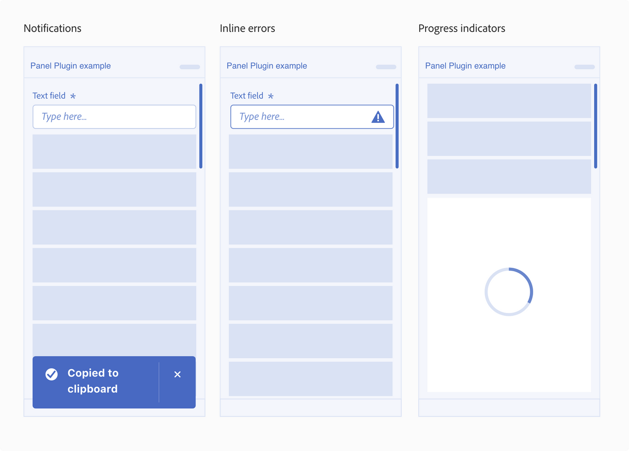
Provide users with feedback as they interact with your plugin. This can be alert and success messaging, permission dialogs, or loaders or progress bars to let them know that something is running in the background.
Here is a guide to help you determine where to render plugin messages:
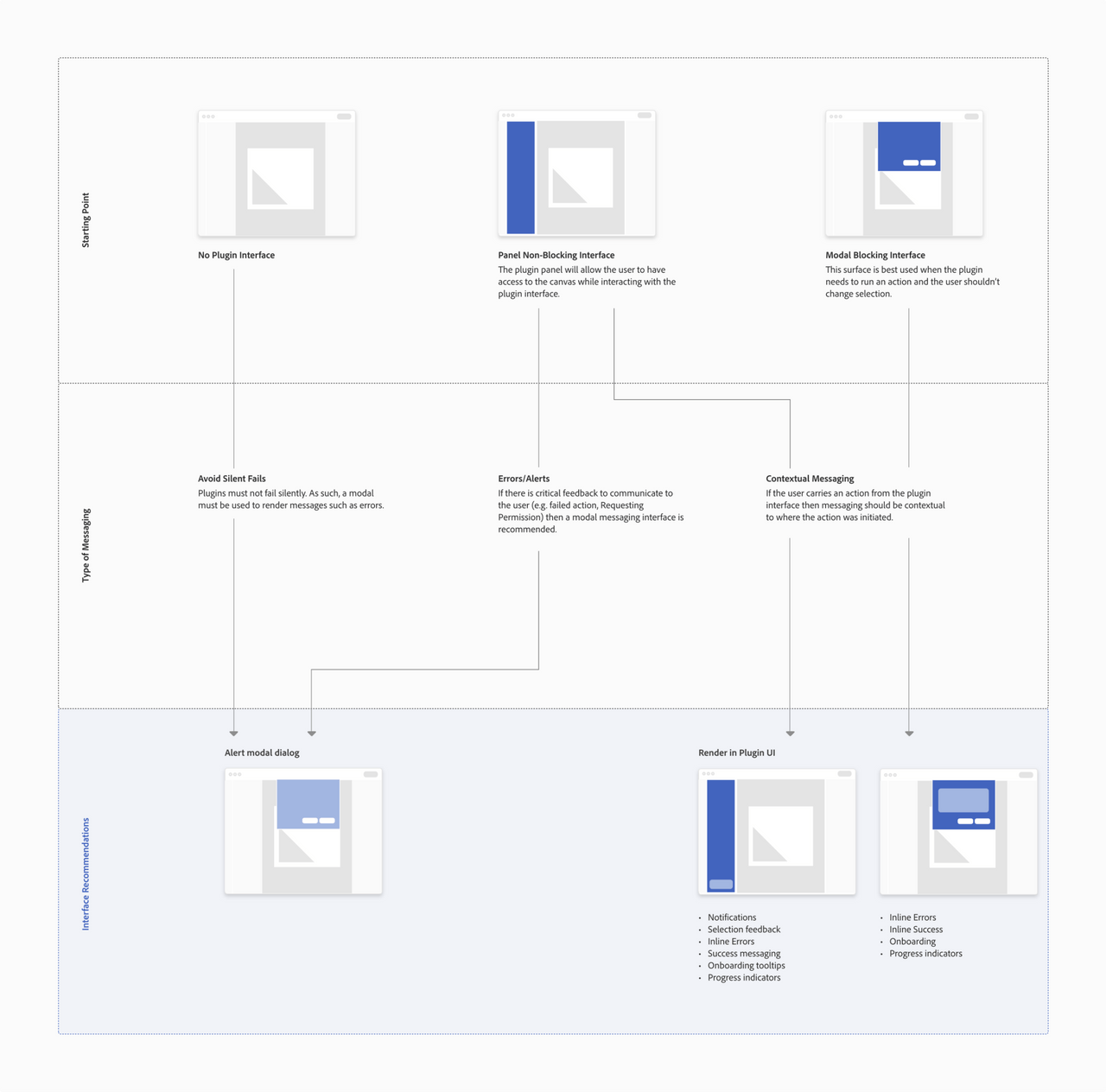
Open this image in a new tab in your browser in order to zoom in on it.
Alerts
Use case
Use alert messaging whenever the plugin cannot perform the intended task, dialogs are persistent until dismissed
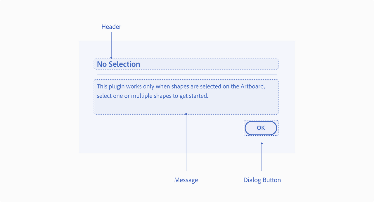
UX requirements
Header
Have a clear header that describes the error
Message
Explain what error was encountered and give a clear actionable solution. Also, avoid blaming the user or the application.
Dialog buttons
Include at least one modal dismissal button to allow the user to dismiss/close the modal
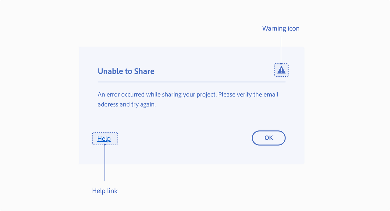
Best practices
Warning icon
To help communicate critical information for an error you can include a warning icon next to the header
Help
If a plugin has a help page, consider adding it to the error modal dialog.
Visual/tutorials
Provide image/GIF example as part of the dialog, to help users understand the actionable solution
Messaging
In the alert messages use language that is easy to understand for the user.
Success
Use case
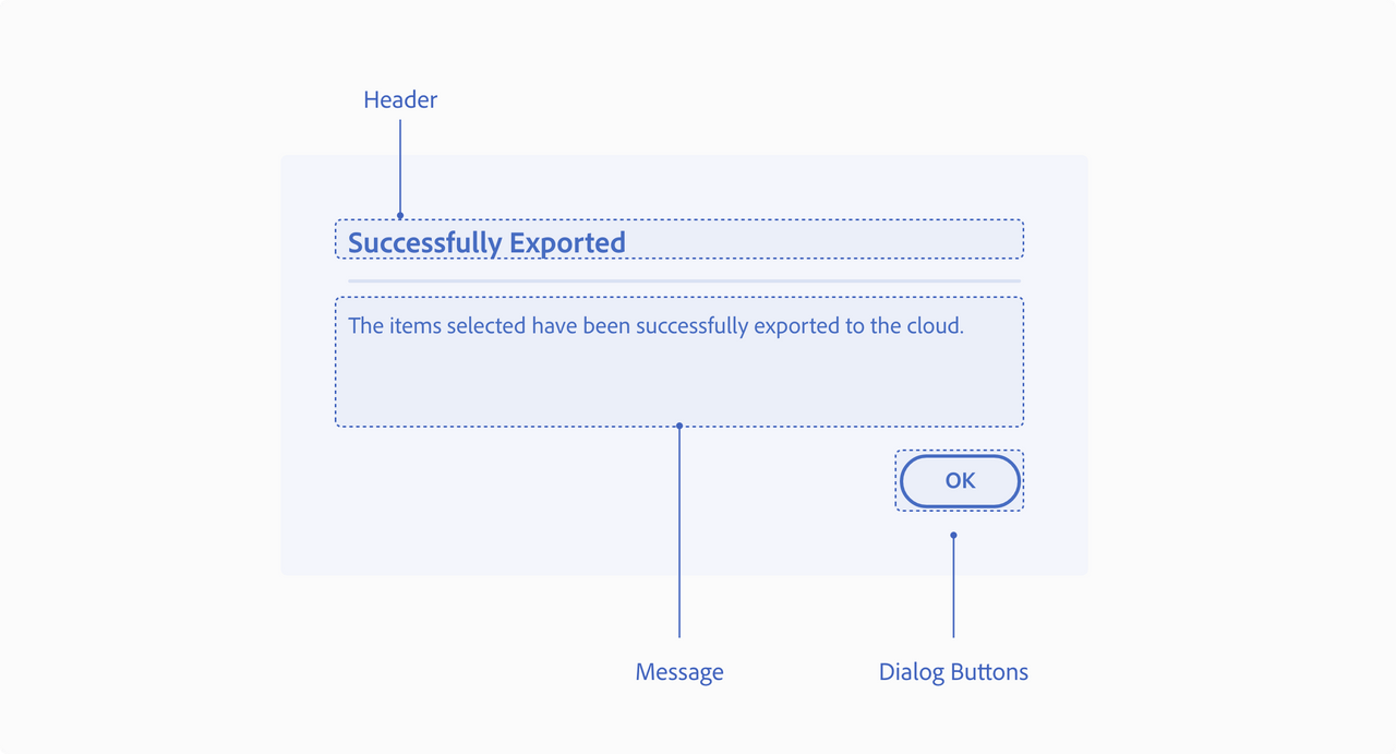
Use success messaging whenever the plugin successfully completes a task and has no visual output on the canvas.
UX requirements
Header
Have a clear header for the dialog.
Message
Explain what the plugin successfully completed, if it is not visually apparent to the user.
Dialog buttons
Include at least one modal dismissal button to allow the user to dismiss/close the modal.
Output
Use case
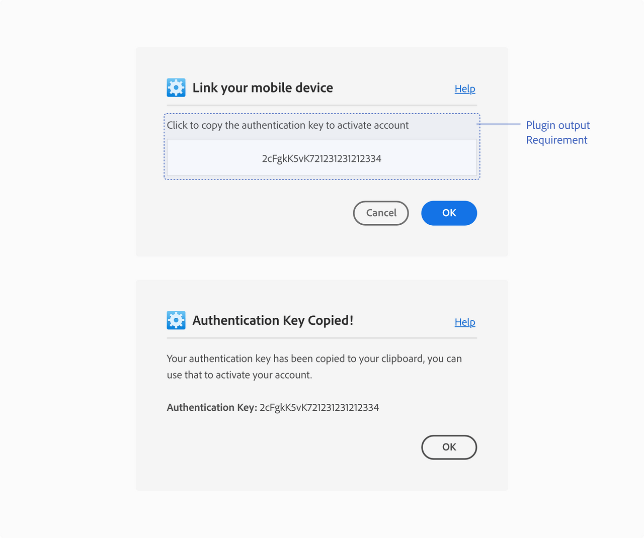
If a plugin generates output that the user needs to complete a workflow, then the plugin needs to provide that information to the user through an interface.
UX requirements
Plugin output
In use cases like these, the plugin output can be shown in the interface, copied onto the clipboard, populated on the document or generate a file.
Example:
Copied onto the clipboard - the plugin can add copy to the clipboard and provides the user with instructions through the interface.
Don’t
Require users to go into the developer console to complete an action.
Permission dialogs
Use case
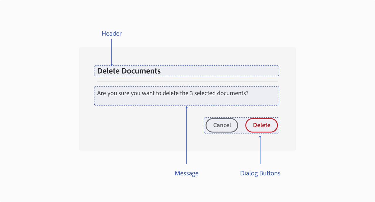
Use permission dialogs when being destructive or making modifications.
UX requirements
Header
Have a clear header for the dialog.
Message
Explain the destructive action or modification and ask for the user’s permission
Dialog buttons
Include a modal dismissal button to allow the user to cancel/close the modal and a negative button (red) to highlight that action.
Key Commands
Esc key or Enter key Dismisses the dialog when the “Cancel” button is in focus
Loaders and Progress Indicators
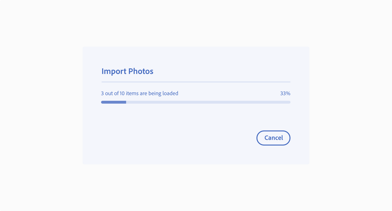
Let the user know when something is happening in the background in the plugin interface.
Best practices
Progress bar
Progress bars show the progression of a system operation: downloading, uploading, processing, etc., in a visual way. They can represent either determinate or indeterminate progress.
Spectrum Progress bar guidelines
Progress circle
Progress circles show the progression of a system operation such as downloading, uploading, processing, etc. in a visual way. They can represent determinate or indeterminate progress.
Spectrum Progress circle guidelines
Examples
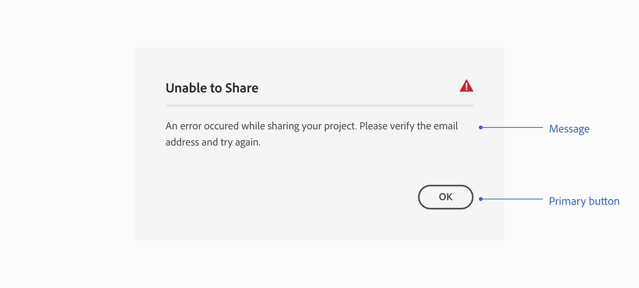
Operation failed to complete
Error dialog - when a plugin can’t complete an operation, render an error dialog to let the user know the operation failed and why it failed.
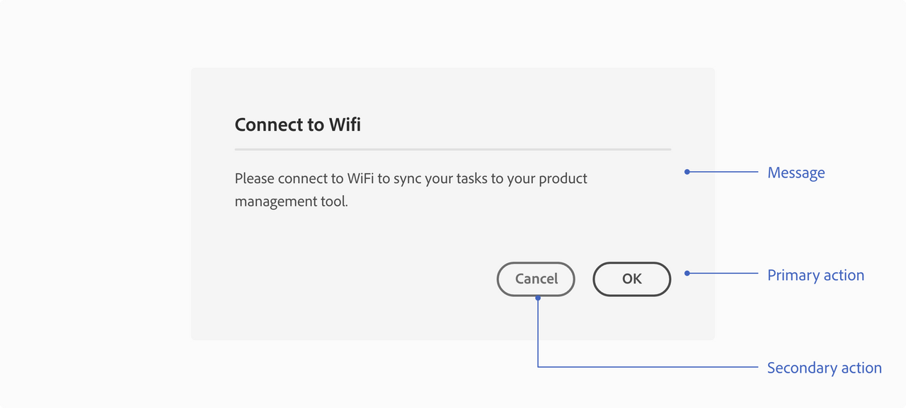
Network connectivity issue
Information dialog - if the plugin is unable to connect to the internet to complete an action, then use an information modal dialog to communicate that to the user.
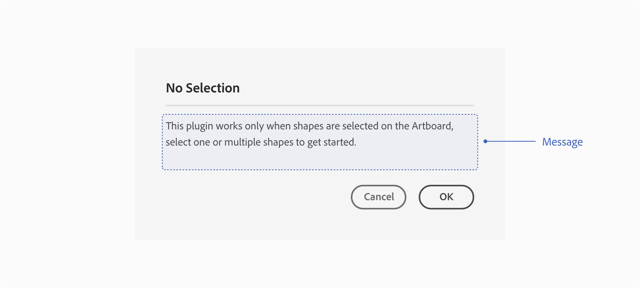
Unable to share
“An error occurred while sharing your project. Please verify the email. address and try again”.
Network connectivity
“Please connect to WiFi to sync your tasks to your product management tool”.
Panel UI messaging
