Implementation Guide
This section will help you implement the concepts and best practices outlined in the UX Guidelines.
Spectrum Design System
Leveraging Spectrum in your add-on allows you to take advantage of all of the built-in benefits it provides while saving front-end development time. There are a few different implementations of Spectrum that are outlined in the sections below for reference, and in order of preferred use.
Check out our code samples for examples of how to use the libraries described here. Refer to the export-sample and Pix sample for a reference on using Spectrum Web Components, and the Dropbox and import-images-using-oauth for specific examples using React Spectrum.
Spectrum Express Theme
If you want your add-on UI to match the Express look-and-feel, you can find Express-themed components available within the Spectrum CSS, Spectrum Web Components and React Spectrum libraries. Each of the sections below has more details on how to use the theme with the different libraries.
Icons
Check out the variety of icons available for use in your add-ons from Spectrum here as well. Additionally, there's a set of icons specificlly for the Express theme in an alpha stage currently available. To use those, install the package with npm i @spectrum-icons/express and then import the ones you want to use.
Spectrum Web Components
The Spectrum Web Components project is an implementation of Spectrum with a set of pre-built UI components that can be easily customized and integrated into your application. These components are designed to work seamlessly together and provide a consistent user experience across different devices and platforms. We highly recommend Spectrum Web Components as the preferred approach for building the UI of your add-ons, since it offers a comprehensive set of components and built-in benefits that make it easy to create consistent, accessible, and responsive user interfaces. Some additional benefits include:
- Framework agnostic
- Lightweight and performant
- Standards based
Spectrum Web Components with React
swc-react is a collection of React wrapper components for the Spectrum Web Components (SWC) library, allowing you to use SWC in your React applications with ease. Currently, swc-react supports 62 components. To install swc-react, simply replace the scope name @spectrum-web-components with @swc-react in the package naming convention in your package.json (ie: "@swc-react/button" instead of "@spectrum-web-components/button"). The sub-package name remains identical to the original SWC component and will be automatically installed along with the swc-react component. Then, you can import and use it in your .jsx like shown in the example below:
Copied to your clipboardimport { Button } from "@swc-react/button";<Button variant="accent">Accent Button</Button>;
Check out the swc-react-theme-sampler code sample for a specific example of how to use it with various components in your add-on, as well as the official documentation for more details on swc-react.
We recommend choosing swc-react over React Spectrum in your add-ons based on React because it currently offers a more comprehensive set of components and built-in benefits.
Spectrum Web Components with Express Theme
Below are the steps for using the Express theme with your Spectrum Web Components UI:
Install the
spectrum-web-componentspackages you would like to use. Thethemepackage is one you will always want to install, but the others are included for illustration. See the Spectrum Web Components site for all of the components available.Copied to your clipboardnpm install @spectrum-web-components/themenpm install @spectrum-web-components/field-labelnpm install @spectrum-web-components/textfieldnpm install @spectrum-web-components/buttonNext, start adding your imports. All add-ons should have this base set of imports, which provide support for Spectrum typography and the base Spectrum theme component, the Express themes, including colors (lightest, light, dark, and darkest) and scale options (medium, large).
Copied to your clipboardimport "@spectrum-web-components/styles/typography.css";import "@spectrum-web-components/theme/sp-theme.js";import "@spectrum-web-components/theme/express/theme-darkest.js";import "@spectrum-web-components/theme/express/theme-dark.js";import "@spectrum-web-components/theme/express/theme-light.js";import "@spectrum-web-components/theme/express/theme-lightest.js";import "@spectrum-web-components/theme/express/scale-medium.js";import "@spectrum-web-components/theme/express/scale-large.js";Then import the specific components you want to use in your code, such as:
Copied to your clipboardimport "@spectrum-web-components/button/sp-button.js";import "@spectrum-web-components/field-label/sp-field-label.js";import "@spectrum-web-components/textfield/sp-textfield.js";Note: The
import '@spectrum-web-components/theme/src/express/themes.js';includes all of the definitions for the Express theme, but you can also only include the specific parts you need. For instance, if you only want to support the light theme and the medium scale, you could specifically include those with:import '@spectrum-web-components/theme/express/theme-light.js'; import '@spectrum-web-components/theme/express/scale-medium.js';For more details on themes and all of the color and scale options, see this link.Use a
webpack.config.jsfor bundling the Spectrum Web Components and your JavaScript into a bundle. If you used the basic javascript template for your add-on, you can copy it in from a sample add-on, such as the SWC one in the contributed samples folder. Also be sure to include the webpack specific dependencies and script options in yourpackage.json, which you can also copy from a sample like SWC. If you find that some files aren't being moved todistafter you build, you'll want to edit the file (line 31,32) to add more file types to copy.Now you can use the
scale,colorandthemeselections you desire with the<sp-theme>component. Within those tags is where you should place all of your content that you want styled with those settings. For example:Copied to your clipboard<body><sp-themescale="medium"color="light"system="express">/* Everything you want styled with those settings */ /* goes within the<sp-theme /> tag */<sp-field-labelrequiredfor="txtName">Enter your full name in the field below</sp-field-label><sp-textfieldmultilinegrowsid="txtName"placeholder="Full Name"></sp-textfield><sp-button>Submit</sp-button></sp-theme></body>
Default vs Express Theme
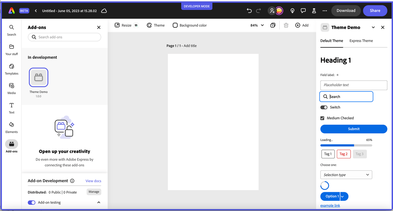
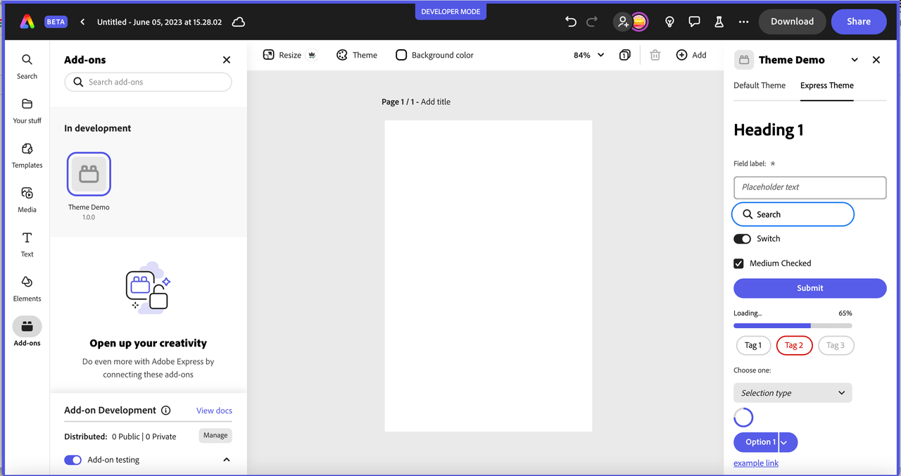
The screenshots below are from a Spectrum Web Components sample app showing some an example of how the components differ between the themes to illustrate some differences for reference.
Default Theme sample:
Express Theme sample:
Check out the code samples in the contributed folder for SWC and Pix for examples of using Spectrum Web Components with plain JavaScript and React accordingly.
React Spectrum
React Spectrum is a project that implements the Adobe's Spectrum design language into React UI components.
React Spectrum is composed of three parts:
- react-spectrum: a component library implementing the Adobe Spectrum design system
- react-aria: a library of React hooks implementing the patterns defined in the ARIA practices spec, including mouse, touch, and keyboard behavior, accessibility, and internationalization support
- react-stately: a library of React hooks implementing cross platform (e.g. web/native) state management for components that need it.
We recommend using swc-react over React Spectrum in your add-ons based on React, because it currently offers a more comprehensive set of components which provide built-in benefits as detailed above in the Spectrum Web Components section, and is more actively supported.
React Spectrum with Express Theme
The React Spectrum Express theme is still in an alpha stage currently, but can be used with the following steps:
Install it in your project with:
npm install @react-spectrum/theme-expressInstall the Express themed icons:
npm install @spectrum-icons/expressImport the theme and icons into your code to use them. For example, notice the following code snippet which imports and sets the Express
theme, lightcolorSchemeoption and mediumscaleoption on the<Provider>object. It also illustrates how to use the Express version of theDeleteicon.Copied to your clipboardimport { theme as expressTheme } from "@react-spectrum/theme-express";import Delete from "@spectrum-icons/express/Delete";const App = ({ addOnUISdk }) => {return (<Providertheme={expressTheme}colorScheme="light"scale="medium"><Button variant="accent"><Delete /></Button></Provider>);};
React Spectrum Theme Examples
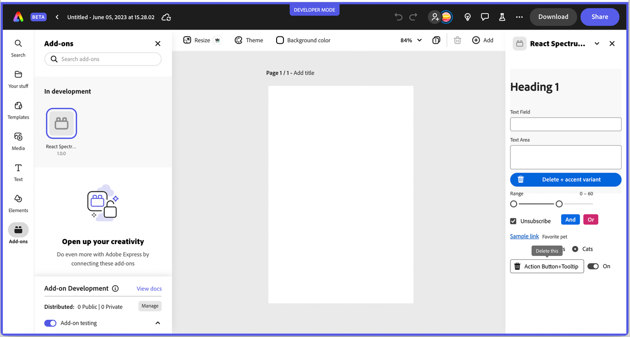
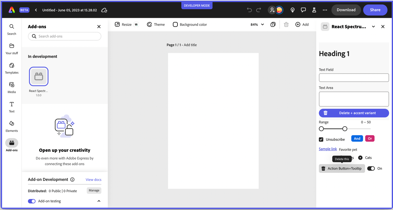
Below is an example of some components from React Spectrum with the two themes. Please note, since the React Spectrum with Express theme project is still in an alpha state, there will be components that haven't been completely ported over yet.
Default theme sample:
Express theme sample:
The React Spectrum Express theme is still in an alpha state, but you can use Spectrum Web Components with React as well. See the Pix code sample in the provided samples for an example of how to mix Spectrum Web Components with React. Specifically, you should note that there are some intricacies when using this combination of Spectrum Web Components and React in terms of event handling, but they can be handled by using a component that wraps the Spectrum Web Components for providing the event handling instead. In the Pix sample, take a look at the wrapper component called WC.jsx for a reference of how to do this.
CAUTION: Using React Spectrum with a Slider Component
If you're using a slider component with React Spectrum, you may notice behavior where if the user moves their mouse out of the panel and releases the mouse pointer, the slider still thinks the mouse pointer is down when the mouse is moved back inside the panel. You can fix this with the following steps:
- Wrap your slider(s) with another element. A <div> works fine.
- Add a ref that points to this div so you can refer to it later.
- Add two event handlers:
onPointerDownCapturewill callsliderContainer.current.setPointerCapture(evt.nativeEvent.pointerId)onPointerUpwill callsliderContainer.current.releasePointerCapture(evt.nativeEvent.pointerId)
Example Snippet
Copied to your clipboardimport React, { useRef } from "react";import { theme as expressTheme } from "@react-spectrum/theme-express";import { Slider, Provider } from "@adobe/react-spectrum";const App = ({ addOnUISdk }) => {const sliderContainer = useRef();const startDrag = (evt) => {sliderContainer.current.setPointerCapture(evt.nativeEvent.pointerId);};const stopDrag = (evt) => {sliderContainer.current.releasePointerCapture(evt.nativeEvent.pointerId);};return (<><Providertheme={expressTheme}colorScheme="light"scale="medium"><divref={sliderContainer}onPointerDownCapture={startDrag}onPointerUp={stopDrag}><Sliderlabel="Cookies to buy"defaultValue={12}/></div></Provider></>);};export default App;
Spectrum CSS
Spectrum CSS is an open-source implementation of Spectrum and includes components and resources to make applications more cohesive. Spectrum CSS is designed to be used in partnership with Spectrum’s detailed usage guidelines.
You should only rely on using the base Spectrum CSS library for simple applications that need basic things like typography, checkboxes, text fields, etc. Otherwise you should try using one of the other implementations provided like Spectrum Web Components and React Spectrum since they include interactivity, event handling etc built-in over what's possible with pure CSS. The best place to start with each of these libraries is to go to the Getting Started page in the top of the docs for each.
Tips
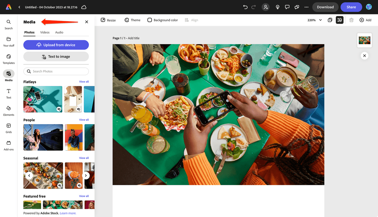
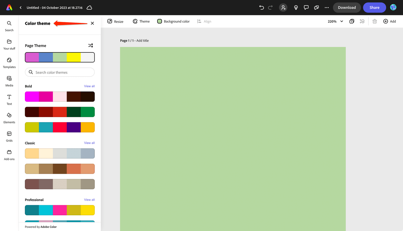
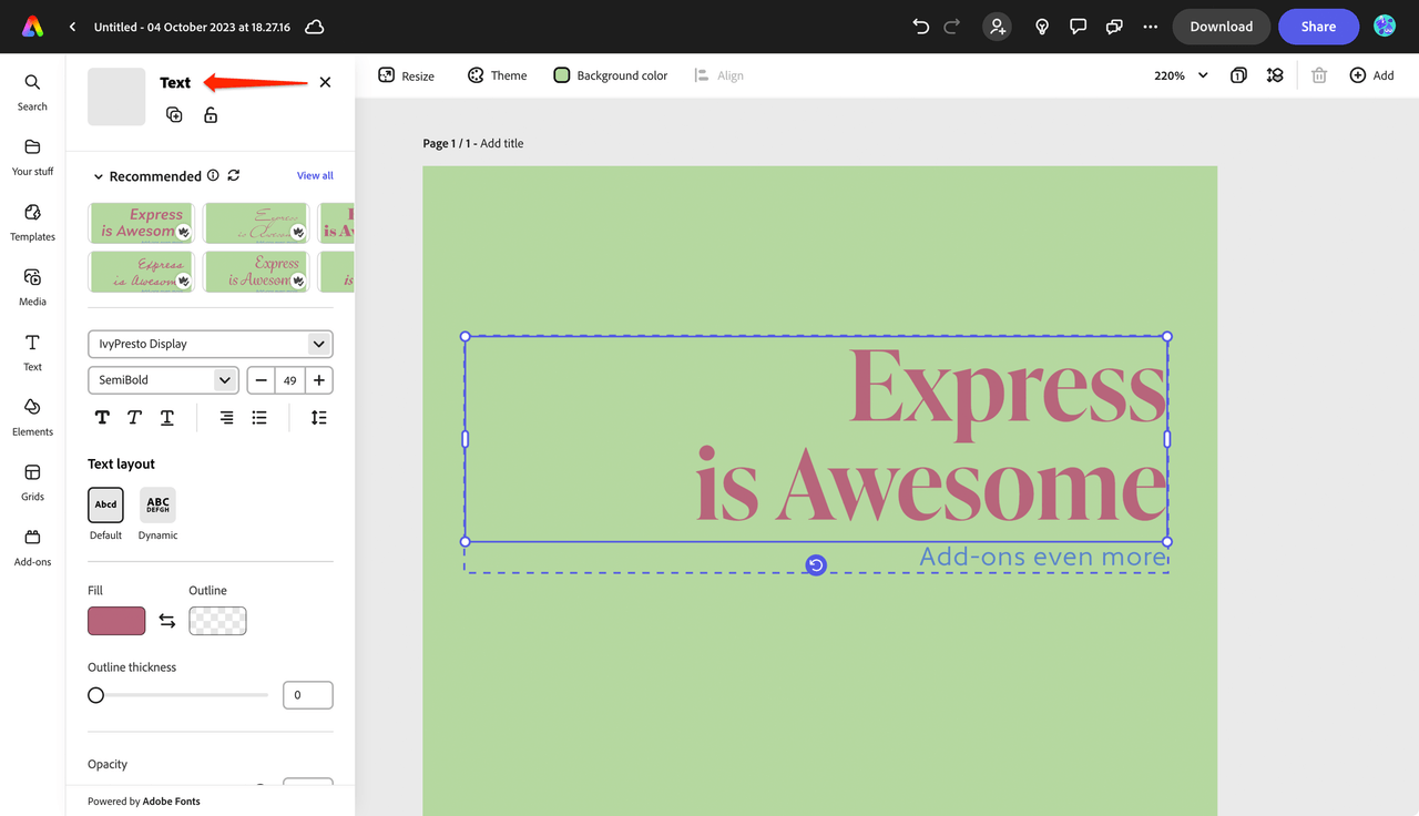
Use the existing Adobe Express UI as an example of the types of patterns and behaviors to use in your own add-on design. For instance, you could take a closer look at the other panels and how the UI is implemented in them to help guide you, such as the Media, Theme and Text panels shown below, which are already part of Express.
Media Panel
Theme Panel
Text Panel
Color Picker Component Tip: If you're using the native browser color picker, it looks slightly different in every browser and doesn't fit the Express theme by default. You can make this control look more like Spectrum with CSS as illustrated in this codepen for reference, or borrow the code used in this guide.
Using Fonts
The following adobe-clean fonts and weights are injected into the add-on and can be used automatically.
Copied to your clipboard{family: "adobe-clean",source: "url('https://use.typekit.net/af/c0160f/00000000000000007735dac8/30/l?primer=f592e0a4b9356877842506ce344308576437e4f677d7c9b78ca2162e6cad991a&fvd=n4&v=3') format('woff2'), url('https://use.typekit.net/af/c0160f/00000000000000007735dac8/30/d?primer=f592e0a4b9356877842506ce344308576437e4f677d7c9b78ca2162e6cad991a&fvd=n4&v=3') format('woff'), url('https://use.typekit.net/af/c0160f/00000000000000007735dac8/30/a?primer=f592e0a4b9356877842506ce344308576437e4f677d7c9b78ca2162e6cad991a&fvd=n4&v=3') format('opentype')",weight: "400",style: "normal",display: "auto"},{family: "adobe-clean",source: "url('https://use.typekit.net/af/95bf80/00000000000000007735dacd/30/l?primer=f592e0a4b9356877842506ce344308576437e4f677d7c9b78ca2162e6cad991a&fvd=i4&v=3') format('woff2'), url('https://use.typekit.net/af/95bf80/00000000000000007735dacd/30/d?primer=f592e0a4b9356877842506ce344308576437e4f677d7c9b78ca2162e6cad991a&fvd=i4&v=3') format('woff'), url('https://use.typekit.net/af/95bf80/00000000000000007735dacd/30/a?primer=f592e0a4b9356877842506ce344308576437e4f677d7c9b78ca2162e6cad991a&fvd=i4&v=3') format('opentype')",weight: "400",style: "italic",display: "auto"},{family: "adobe-clean",source: "url('https://use.typekit.net/af/5c07ba/00000000000000007735dad8/30/l?primer=f592e0a4b9356877842506ce344308576437e4f677d7c9b78ca2162e6cad991a&fvd=n7&v=3') format('woff2'), url('https://use.typekit.net/af/5c07ba/00000000000000007735dad8/30/d?primer=f592e0a4b9356877842506ce344308576437e4f677d7c9b78ca2162e6cad991a&fvd=n7&v=3') format('woff'), url('https://use.typekit.net/af/5c07ba/00000000000000007735dad8/30/a?primer=f592e0a4b9356877842506ce344308576437e4f677d7c9b78ca2162e6cad991a&fvd=n7&v=3') format('opentype')",weight: "700",style: "normal",display: "auto"},{family: "adobe-clean",source: "url('https://use.typekit.net/af/2dda0a/00000000000000007735dad4/30/l?primer=f592e0a4b9356877842506ce344308576437e4f677d7c9b78ca2162e6cad991a&fvd=n8&v=3') format('woff2'), url('https://use.typekit.net/af/2dda0a/00000000000000007735dad4/30/d?primer=f592e0a4b9356877842506ce344308576437e4f677d7c9b78ca2162e6cad991a&fvd=n8&v=3') format('woff'), url('https://use.typekit.net/af/2dda0a/00000000000000007735dad4/30/a?primer=f592e0a4b9356877842506ce344308576437e4f677d7c9b78ca2162e6cad991a&fvd=n8&v=3') format('opentype')",weight: "800",style: "normal",display: "auto"},{family: "adobe-clean",source: "url('https://use.typekit.net/af/bc79c1/00000000000000007735dad9/30/l?primer=f592e0a4b9356877842506ce344308576437e4f677d7c9b78ca2162e6cad991a&fvd=n9&v=3') format('woff2'), url('https://use.typekit.net/af/bc79c1/00000000000000007735dad9/30/d?primer=f592e0a4b9356877842506ce344308576437e4f677d7c9b78ca2162e6cad991a&fvd=n9&v=3') format('woff'), url('https://use.typekit.net/af/bc79c1/00000000000000007735dad9/30/a?primer=f592e0a4b9356877842506ce344308576437e4f677d7c9b78ca2162e6cad991a&fvd=n9&v=3') format('opentype')",weight: "900",style: "normal",display: "auto"}
Importing custom fonts
You can use a custom font with a URL by either linking to it via the @import rule, the <link> tag, or the @font-face rule.
Via the @import rule:
Copied to your clipboard<style>@import url("https://fonts.googleapis.com/css2?family=Poppins:wght@200;300;400;500;600;700&display=swap");* {font-family: "Poppins", sans-serif;margin: 0;padding: 0;}</style>
Via the <link> tag:
Copied to your clipboard<head><meta charset="utf-8" /><linkrel="stylesheet"href="https://fonts.googleapis.com/css?family=Tangerine"/><style>body {font-family: "Tangerine", serif;font-size: 48px;}</style></head>
Via the @font-face rule
Specify a name for the font and where it can be found, then use it on the desired HTML tag with the specified name. For example:
Copied to your clipboard@font-face {font-family: "MyWebFont";src: url("https://mdn.github.io/css-examples/web-fonts/VeraSeBd.ttf");}body {font-family: "MyWebFont", serif;}
Using custom fonts can be great for design, but it's important to also understand that it can can cause a performance hit because the font must be downloaded before it's displayed. Note that the @font-face src: supports a local attribute as well which will try to load the font from the users local system first, which can help mitigate the performance hit. See this link for full details.
FAQ
Q: Which Spectrum implementation should I choose for my add-on?
A: We recommend this priority order:
- Spectrum Web Components - Best overall choice, framework-agnostic, lightweight, and comprehensive
- swc-react - If you're using React and want Spectrum Web Components with React patterns
- React Spectrum - Only if you specifically need React Spectrum features (note: Express theme is in alpha)
- Spectrum CSS - Only for very simple applications with basic styling needs
Q: What's the difference between Spectrum Web Components and swc-react?
A: Spectrum Web Components are native web components that work with any framework or vanilla JavaScript. swc-react provides React wrapper components for the same Spectrum Web Components, making them easier to use in React applications with proper event handling and React patterns.
Q: Can I mix different Spectrum implementations in the same add-on?
A: It's not recommended. Mixing implementations can lead to version conflicts, duplicate code, and inconsistent behavior. Choose one approach and stick with it throughout your add-on.
Q: How do I ensure my add-on matches the Adobe Express look and feel?
A: Use the Express theme with your chosen Spectrum implementation:
- Spectrum Web Components: Import Express theme files and use
system="express" - swc-react: Same as Spectrum Web Components but with React syntax
- React Spectrum: Use
@react-spectrum/theme-express(currently in alpha)
Q: Why do I need webpack for Spectrum Web Components?
A: Webpack properly bundles Spectrum Web Components and their complex dependencies. The CLI's default bundler doesn't handle the module structure correctly, so webpack ensures optimal performance and correct packaging.
Q: What if I get version conflicts with Spectrum components?
A: All Spectrum packages in your project must use identical versions. Check your package.json and ensure every @spectrum-web-components/* or @swc-react/* package uses the same version number. Run npm install after updating versions.
Q: Can I customize Spectrum components while maintaining the Express theme?
A: Yes! Use Spectrum CSS variables and component modifier variables (prefixed with --mod-*) for customizations. This ensures your styling remains consistent with the design system and updates automatically when the design system changes.
Q: How do I handle events with Spectrum Web Components in React?
A: Use the WC.jsx helper component (as shown in code samples) to wrap Spectrum Web Components. This solves React synthetic event issues by automatically registering native browser events that web components understand.
Q: Are there Express-specific icons available?
A: Yes! Install @spectrum-icons/express for Express-themed icons. You can also use icons from @spectrum-web-components/icons-workflow and @spectrum-web-components/icons-ui libraries.
Q: What fonts are available in Adobe Express add-ons?
A: Adobe Clean fonts are automatically injected and available in weights 400, 700, 800, and 900 (including italic for 400). You can also import custom fonts using @import, <link> tags, or @font-face rules, but be aware of performance implications.
Q: Can I use Spectrum components without the Express theme?
A: Yes, but your add-on won't match the Adobe Express interface. The Express theme ensures visual consistency with the host application and provides the best user experience.
Useful Resources
- Figma plugin that provides Spectrum UI elements.

