Lesson 2: Use Spectrum Web Components in a React-based add-on
Learn how to configure and use Spectrum Web Components in a ReactJS add-on.
Introduction
In this lesson, you will implement the bingo card generator add-on in a React-based project with a library called swc-react, a collection of wrapper components designed to make Spectrum Web Components (SWC) work like native React components in a React application. They serve as a bridge between React and Spectrum Web Components, and their properties and event names are directly derived from their corresponding SWC components. As such, the corresponding Spectrum Web Components documentation can be used as the documentation reference.
We recommend using swc-react over React Spectrum currently since the Spectrum Web Components library provides a more extensive set of components with an explicit Express theme that is continuously updated. React Spectrum’s Express theme is in alpha, doesn't have full component coverage, and is currently not being updated. Please note, however, that a new version of Spectrum will be released sometime this year, and an update to the React Spectrum libraries will follow. In the meantime we recommend using the swc-react wrappersx.
Steps
Create project
Create a new project with the CLI based on the
react-javascripttemplate:npx @adobe/create-ccweb-add-on bingo-card-generator-react --template react-javascriptOpen the project in your favorite code editor and navigate to the
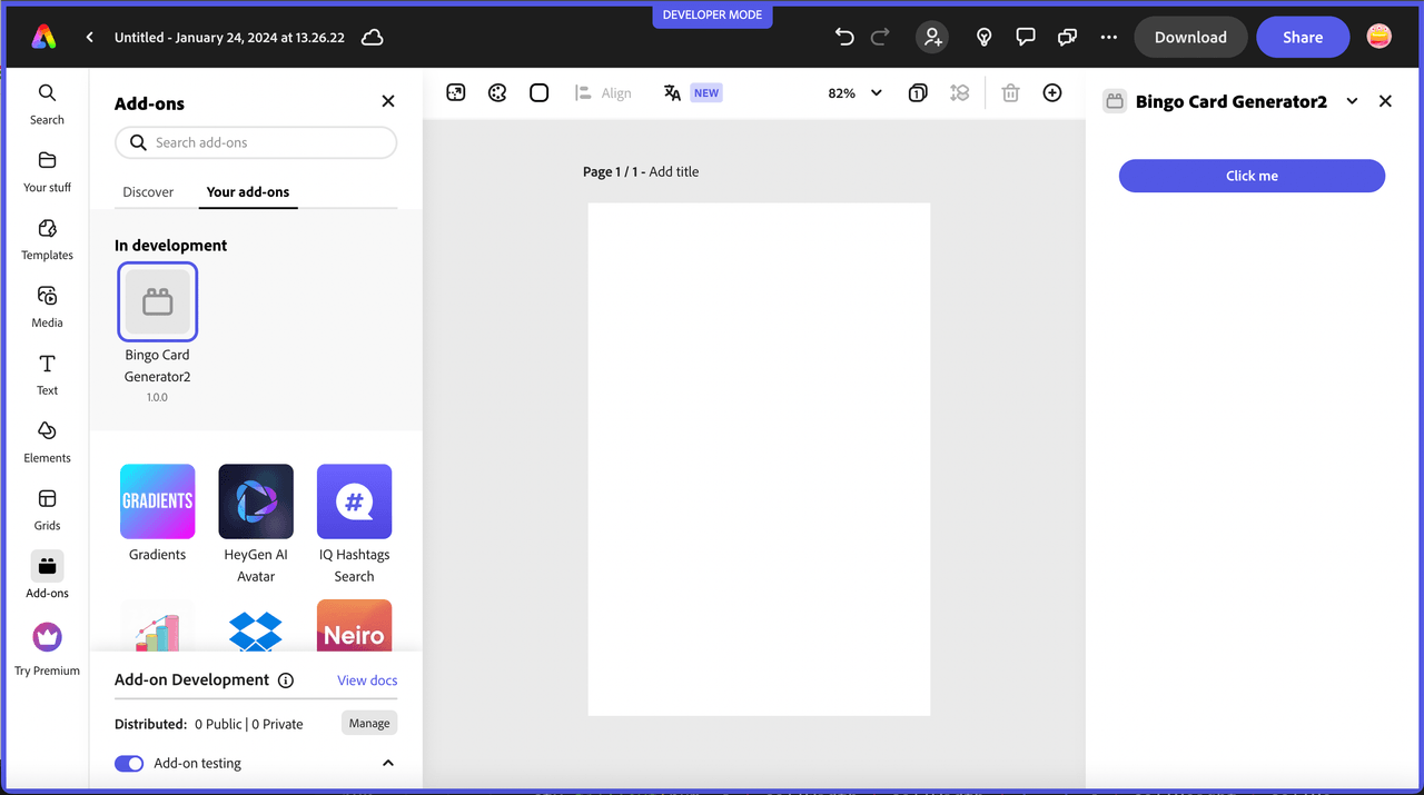
src/components/App.jsxfile. Notice that it's preconfigured with the@swc-react/themeand@swc-react/buttonpackages and their associated imports, with a basic usage. If you run the project at this point, you should see the button show up in your add-on:
Take a moment to get familiar with what's included in the generated project before moving on. Notice it's pre-configured for webpack, so you don't have to do those configuration steps you had to do in lesson 1 for the basic JavaScript project.
Install swc-react components
Next, start installing the UI components to your new add-on project for use. These components are installed in a similar fashion to how you installed the Spectrum Web Components to lesson 1, via
npm installoryarn add, with just a change to the package prefix, from@spectrum-web-componentsto@swc-react. Remember, the @swc-react/button and @swc-react/theme components were already included in the project generated by the template, so you can skip those.Copied to your clipboardnpm install @swc-react/button-group@0.39.4 @swc-react/field-label@0.39.4 @swc-react/menu@0.39.4 @swc-react/picker@0.39.4 @swc-react/slider@0.39.4 @swc-react/swatch@0.39.4 @swc-react/switch@0.39.4NOTE: The above command specifies the
0.39.4version specifically, due to an issue found with compatibility using the latest default version0.40.3as of this writing.Alternatively, replace the
dependenciesblock in yourpackage.jsonfile with the following, and then runnpm installto install them all at once:Copied to your clipboard"dependencies": {"@swc-react/button": "0.39.4","@swc-react/button-group": "0.39.4","@swc-react/field-label": "0.39.4","@swc-react/menu": "0.39.4","@swc-react/picker": "0.39.4","@swc-react/slider": "0.39.4","@swc-react/swatch": "0.39.4","@swc-react/switch": "0.39.4","@swc-react/theme": "0.39.4","react": "18.2.0","react-dom": "18.2.0"},
IMPORTANT: You must ensure the versions of all of the @swc-react component packages installed are the same, or you will see errors upon build or while running. You can open your package.json file to double check to ensure they all match before moving on.
Import swc-react components
In this step you will add the UI component imports for the bingo card generator add-on. The pattern of the imports will follow in a similar manner to what was included in the generated project for Button and Theme.
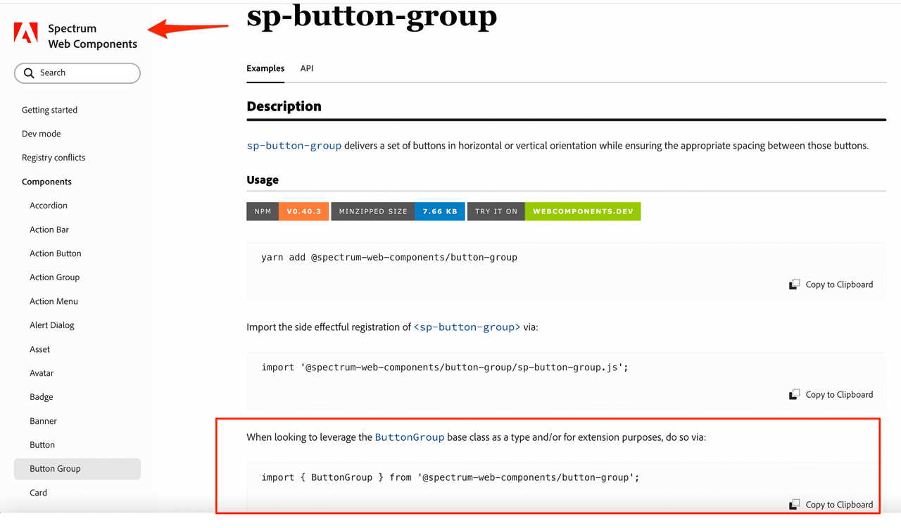
As a tip, you can use the Spectrum Web Components Reference for the corresponding component, and in the Usage section you will see that the third import uses the class name for the component, which is what you will need, as well as the specific package to use, it will just be prefixed with @swc-react instead.
So, for example, the first import is for the Button Group component. If you look at the Spectrum Web Components - Button Group Usage, the last import definition shows import { ButtonGroup } from '@spectrum-web-components/button-group';. It's outlined in the image below for visual reference:

You can simply copy that import from the reference for any given component you want to use in your add-on, and just change the prefix from @spectrum-web-components to @swc-react. (Notice the existing imports for Button and Theme). The resulting import to use in your add-on would be:
import { ButtonGroup } from '@swc-react/button-group';.
You can then use this same pattern for all of the @swc-react wrapper components you want to use.
The imports needed for the bingo card generator add-on sample are listed below for you to copy into your src/components/App.jsx file, along with the existing Button and Theme imports:
Copied to your clipboardimport { ButtonGroup } from '@swc-react/button-group';import { FieldLabel } from '@swc-react/field-label';import { MenuItem } from '@swc-react/menu';import { Picker } from '@swc-react/picker';import { Slider } from '@swc-react/slider';import { Swatch } from '@swc-react/swatch';import { Switch } from "@swc-react/switch";
Create event helper class
Next you'll need to create a new class to handle a known issue where React events and web components don't always work well together. See this issue for more details. The issue is most often seen in the case of the React onChange event, and the events won't properly fire. An option to work around this is to create a helper class that will automatically register the native browser version of the events for the components to ensure they are properly fired.
Create a new file in your src/components folder and name it WC.jsx, then copy in the block of code below and save it.
Note: this class is also included in the lesson 2 final project if you want to copy it in from there instead.
Copied to your clipboardimport React from "react";export class WC extends React.Component {constructor(props) {super(props);this.el = React.createRef();this.handleEvent = this.handleEvent.bind(this);}handleEvent(evt) {const propName = `on${evt.type[0].toUpperCase()}${evt.type.substr(1)}`;if (this.props[propName]) {this.props[propName].call(evt.target, evt);}}componentDidMount() {const el = this.el.current;const eventProps = Object.entries(this.props).filter(([k,v]) => k.startsWith("on"));eventProps.forEach(([k,v]) => el.addEventListener(k.substr(2).toLowerCase(), this.handleEvent));}componentWillUnmount() {const el = this.el.current;const eventProps = Object.entries(this.props).filter(([k,v]) => k.startsWith("on"));eventProps.forEach(([k,v]) => el.removeEventListener(k.substr(2).toLowerCase(), this.handleEvent));}render() {const filteredProps = Object.fromEntries(Object.entries(this.props).filter(([k,v]) => !k.startsWith("on")));return <div ref={this.el} {...filteredProps}>{this.props.children}</div>}}
Now, go back into your src/components/App.jsx and import your new WC helper class under the React and App.css imports, for instance:
Copied to your clipboardimport React, { useState, useRef } from "react";import "./App.css";import { WC } from "./WC.jsx";
Build UI with swc-react components
At this point, you are ready to start using the swc-react components. You'll also wrap some with the <WC> helper class as needed to handle events appropriately. Open your src/components/App.jsx file and replace the current <Theme> block in the UI section with the following block:
Copied to your clipboard<Theme theme="express" scale="medium" color="light"><div className="container"><div className="row gap-20"><div className="column"><FieldLabel size="l">Background color</FieldLabel><WC onChange={onBgColorClick}><Swatch className="color-well" color={bgColorSwatch}></Swatch></WC><input ref={bgColorInput} type="color" style={{display: "none"}}value={bgColor} onChange={onBgColorChange}/></div><div className="column"><FieldLabel size="l">Number color</FieldLabel><WC onChange={onFgColorClick}><Swatch className="color-well" color={fgColorSwatch}></Swatch></WC><input ref={fgColorInput} type="color" style={{display: "none"}}value={fgColor} onChange={onFgColorChange}/></div><div className="column"><FieldLabel size="l">Title color</FieldLabel><WC onChange={onTitleColorClick}><Swatch className="color-well" color={titleColorSwatch}></Swatch></WC><input ref={titleColorInput} type="color" style={{display: "none"}}value ={titleColor} onChange={onTitleColorChange}/></div></div><div className="row gap-20"><div className="column margin-top-10"><FieldLabel size="l">Font Weight</FieldLabel><Picker size="m" value={fontWeightPicker}change={event => setFontWeightPicker(event.target.value)}><MenuItem value="normal">Normal</MenuItem><MenuItem value="bold">Bold</MenuItem><MenuItem value="lighter">Lighter</MenuItem></Picker></div><div className="column"><WC onChange={event => setFreeSpaceToggle(event.target.checked)}><Switch emphasized checked={freeSpaceToggle} size="l">Free space</Switch></WC></div></div><div className="row gap-20"><WC onChange={event => setGridlineSize(event.target.value)}><Slider label="Gridlines size" variant="filled" editable value={gridlineSize}hide-stepper min="1" max="10"format-options='{"style": "unit", "unit": "px"}' step="1"></Slider></WC><div className="column"><FieldLabel size="l">Color</FieldLabel><WC onChange={onGridColorClick}><Swatch className="color-well" color={gridColorSwatch}></Swatch></WC><input ref={gridColorInput} type="color" style={{display: "none"}}value={gridColor} onChange={onGridColorChange}/></div></div><div><ButtonGroup horizontal><Button onClick={generateBingoCard}>Generate card</Button><Button onClick={handleAddToPage} disabled={!addToPageEnabled} variant="secondary">Add to page</Button></ButtonGroup></div><div className="margin-top-10"><canvas ref={bingoCanvas}/></div></div></Theme>
Note the use of the <WC>..</WC> component created in the previous step to wrap the swc-react components to ensure the events are are properly fired.
Wire UI code and add canvas drawing logic
If you tried to run your add-on at this point, you would get a blank UI, and a check of the devtools console would reveal errors, since the UI components added above call functions that don't exist yet. So next you will add the logic to enable the UI components to work in your src/components/App.jsx. (In a typical project you would probably have more of a separation of concerns with your code rather that everything in the App.jsx, but for the purposes of this lesson, it will suffice).
Replace the current logic for the original button component in the top of the App class before the return (...) with the code below. You can also reference the App.jsx file of the final project for reference if you have any trouble:
Copied to your clipboard// State variables to hold component valuesconst [bgColor, setBgColor] = useState("#f2f2f2");const [bgColorSwatch, setBgColorSwatch] = useState("#f2f2f2");const [fgColor, setFgColor] = useState("#5258e5");const [fgColorSwatch, setFgColorSwatch] = useState("#5258e5");const [titleColor, setTitleColor] = useState("#000000");const [titleColorSwatch, setTitleColorSwatch] = useState("#000000");const [gridColor, setGridColor] = useState("#5258e5");const [gridColorSwatch, setGridColorSwatch] = useState("#5258e5");const [fontWeightPicker, setFontWeightPicker] = useState("normal");const [freeSpaceToggle, setFreeSpaceToggle] = useState(true);const [gridlineSize, setGridlineSize] = useState(5);const [addToPageEnabled, setAddToPageEnabled] = useState(false);// Refs to the UI elements for colors, add button and HTML canvasconst fgColorInput = useRef(null);const bgColorInput = useRef(null);const gridColorInput = useRef(null);const titleColorInput = useRef(null);const bingoCanvas = useRef(null);// Function to generate the bingo card using an HTML canvas and drawing contextfunction generateBingoCard() {const ctx = bingoCanvas.current.getContext("2d");// Set canvas width and heightbingoCanvas.current.width = 300;bingoCanvas.current.height = 360;// Set grid propertiesconst numRows = 6;const numCols = 5;const cellWidth = 60;const cellHeight = 60;// Fill background boxes with selected bg colorctx.fillStyle = bgColor;for (let x = gridlineSize/2; x <= bingoCanvas.current.width; x += cellWidth-gridlineSize) {for (let y = gridlineSize/2; y <= bingoCanvas.current.height; y += cellHeight-gridlineSize) {ctx.fillRect(x, y, cellWidth, cellHeight);}}// Draw gridlinesctx.lineWidth = gridlineSize;let x=0;let y=0;for (let i = 0; i <= numCols; i++) {// Need to adjust for left/right gridlines sizeif (i===0) {ctx.moveTo(gridlineSize/2, 0);ctx.lineTo(gridlineSize/2, bingoCanvas.current.height);}else {ctx.moveTo(i * cellWidth-gridlineSize/2, 0);ctx.lineTo(i * cellWidth-gridlineSize/2, bingoCanvas.current.height);}}for (let i = 0; i <= numRows; i++) {// Need to adjust for top/bottom gridlines sizeif (i===0) {ctx.moveTo(0, gridlineSize/2);ctx.lineTo(bingoCanvas.current.height, gridlineSize/2,);}else {ctx.moveTo(0, i * cellWidth-gridlineSize/2);ctx.lineTo(bingoCanvas.current.height, i * cellWidth-gridlineSize/2);}}ctx.strokeStyle = gridColor; // Gridlines colorctx.stroke();// Draw bingo titlectx.font = fontWeightPicker +' 28px adobe clean';ctx.textAlign = "center";ctx.textBaseline = 'middle';ctx.fillStyle = titleColor; // title font colorlet bingoTitle = ['B','I','N','G','O'];for (let charCnt = 0; charCnt < bingoTitle.length; charCnt++) {let letter = bingoTitle[charCnt];ctx.fillText(letter, charCnt * cellWidth + cellWidth / 2, cellHeight / 2 + 6);}// Fill in the card with random numbers and a free space if checkedconst freeSpace = [3, 2]; // Coordinates of the FREE spaceconst numbers = [];const usedNumbers = new Set(); // Track used numbersctx.font = fontWeightPicker +' 22px adobe clean';ctx.fillStyle = fgColor; // color of the foreground (numbers)for (let i = 1; i < numRows; i++) {numbers[i] = [];for (let j = 0; j < numCols; j++) {if (freeSpaceToggle) {if (i === freeSpace[0] && j === freeSpace[1]) {numbers[i][j] = "FREE";continue; // Skip the FREE space}}let num;do {num = Math.floor(Math.random() * 15) + 1 + (j * 15);} while (usedNumbers.has(num)); // Generate unique numbersusedNumbers.add(num);numbers[i][j] = num;ctx.fillText(num, j * cellWidth + cellWidth / 2 - 3, i * cellHeight + cellHeight / 2 + 3);}}// Draw "FREE" if the toggle is checkedif (freeSpaceToggle) {ctx.font = fontWeightPicker +' 20px adobe clean';ctx.fillText("FREE", freeSpace[1] * cellWidth + cellWidth / 2 - 3, freeSpace[0] * cellHeight + cellHeight / 2 + 3);}// Enable drag and drop for the cardaddOnUISdk.app.enableDragToDocument(bingoCanvas.current, {previewCallback: el => new URL(bingoCanvas.current.toDataURL()),completionCallback: async el => {const r = await fetch(bingoCanvas.current.toDataURL());const blob = await r.blob();return [{blob}];}})// Enable add card buttonsetAddToPageEnabled(true);}// Trigger click on the native color picker input for eachfunction onBgColorClick(e) {bgColorInput.current.click();}function onFgColorClick(e) {fgColorInput.current.click();}function onTitleColorClick(e) {titleColorInput.current.click();}function onGridColorClick(e) {gridColorInput.current.click();}// Update the state values with the color selected from the native color picker for eachfunction onFgColorChange(e) {setFgColorSwatch(e.target.value);setFgColor(e.target.value);}function onBgColorChange(e) {setBgColorSwatch(e.target.value);setBgColor(e.target.value);}function onTitleColorChange(e) {setTitleColorSwatch(e.target.value);setTitleColor(e.target.value);}function onGridColorChange(e) {setGridColorSwatch(e.target.value);setGridColor(e.target.value);}async function handleAddToPage() {const blob = await new Promise((resolve, reject) => {bingoCanvas.current.toBlob(blob => { resolve(blob); })})addOnUISdk.app.document.addImage(blob);}
IMPORTANT!:
Since you're using the React useRef to get references to some of the components, you'll need to add it to the import at the top of your App.jsx, along with the useState that's currently included. So the result of the import section would look like:
Copied to your clipboardimport React, { useState, useRef } from "react"; /* add useRef here */import "./App.css"; /* already existed */import { WC } from "./WC.jsx"; /* you added in prior step */
Style your UI
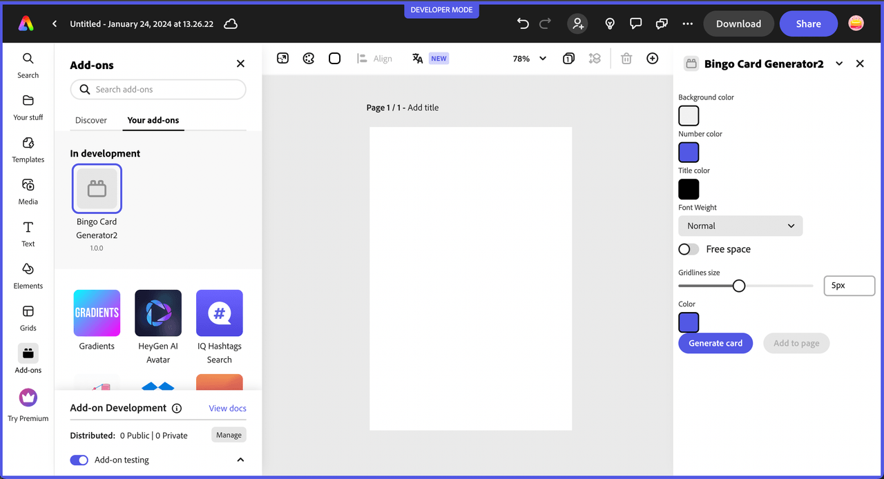
If you run your add-on project now with npm run build; npm run start (or if it was already running and automatically refreshed), you should see something like the following:

Similar to lesson 1, you'll see that the layout of the UI is not great. In this step you'll add the styling to present the UI as you did in lesson 1.
Open the /src/components/App.css file and replace the current contents with the following custom type, class and id selectors for your UI, then check to see the updates reflected in your add-on before moving to the final part of the tutorial.
Copied to your clipboardsp-theme {display: grid;}h2 {font-weight: var(--spectrum-global-font-weight-black);}sp-swatch {width: var(--spectrum-swatch-size-medium);}sp-button {flex: 1;max-width: calc((100% - var(--spectrum-global-dimension-static-size-250)) / 2);}sp-textfield,sp-picker {width: var(--spectrum-global-dimension-static-size-1700);display: flex;}sp-number-field {width: 100%;}sp-button-group {margin-top: var(--spectrum-global-dimension-static-size-300);width: 100%;display: flex;justify-content: space-between;}sp-slider {width: var(--spectrum-global-dimension-static-size-2800);--spectrum-slider-font-size: var(--spectrum-font-size-100);}sp-field-label {font-size: var(--spectrum-global-dimension-font-size-100);}.color-well {cursor: pointer;--mod-swatch-border-thickness: var(--spectrum-divider-thickness-small);--mod-swatch-border-color: var(--spectrum-transparent-black-500);}.row {display: flex;flex-direction: row;justify-content: space-between;width: 100%;align-items: flex-end;}.column {display: flex;flex-direction: column;}.gap-20 {gap: var(--spectrum-global-dimension-static-size-250);}.margin-top-10 {margin-top: var(--spectrum-global-dimension-static-size-125);}#bingoCanvas {width: 290px;}
