SmallImageTemplate
SmallImageTemplate is only available in AEP Messaging iOS SDK version 5.3.0+
This class represents a SmallImage templated content card authored in Adobe Journey Optimizer.
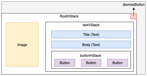
A small image template content card includes a title, body, image, and a maximum of three buttons. The image is displayed in line with the text content. An optional dismiss button can be added to dismiss the content card.
Use the SmallImageTemplate class to customize the appearance of the small image templated content cards.
SmallImageTemplate conforms to ObservableObject, allowing it to be used reactively in SwiftUI views.
Layout

Public properties
| Property | Type | Description |
|---|---|---|
title | The title text for the content card. | |
body | Optional The body text of the content card | |
image | Optional The image to be shown on the content card. | |
buttons | Optional The list of buttons on the content card. | |
buttonHStack | A horizontal stack for arranging buttons. | |
textVStack | A vertical stack for arranging the title, body, and buttons. | |
rootHStack | A horizontal stack for arranging the image and text stack. | |
dismissButton | Optional The dismiss button for the content card. |

