Add configuration
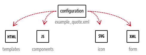
The configuration file defines the settings and references to your content type files. You will return to this file often to update references and change settings during the development process.
Files referenced from the configuration include the HTML templates, the JavaScript components, the icon displayed for your content type in the Page Builder panel, and the UI component form for your content type editor within the Admin.

Configuration conventions
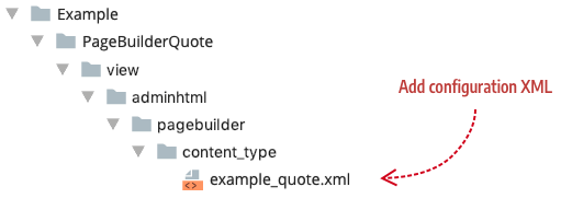
By convention, Page Builder requires the configuration file to be in the <module_name>/view/adminhtml/pagebuilder/content_type directory.
The name of your configuration file should reflect the name of your content type prefixed by your module vendor name and separated by an underscore (_). For example, our module name is Example/PageBuilderQuote and our content type is a quote control, so we name our configuration file example_quote.xml and add it to our module within the following directory structure (view/adminhtml/pagebuilder/content_type/):

The reason we suggest prefixing your content type with your vendor name is to prevent Adobe Commerce from merging your content type configuration file with another configuration file of the same name, or with a future content type published by Adobe.
The example_quote configuration
Only a subset of configuration elements are described in our Quote example (enough to understand the basic role of the configuration file). For more details, refer to Content type configurations and Additional configurations.
The following configuration is from the Quote content type. An overview of these elements and attributes are described in the tables that follow.
Copied to your clipboard<?xml version="1.0"?><config xmlns:xsi="http://www.w3.org/2001/XMLSchema-instance" xsi:noNamespaceSchemaLocation="urn:magento:module:Magento_PageBuilder:etc/content_type.xsd"><type name="example_quote"label="Quote"menu_section="elements"component="Magento_PageBuilder/js/content-type"preview_component="Example_PageBuilderQuote/js/content-type/example-quote/preview"master_component="Magento_PageBuilder/js/content-type/master"form="pagebuilder_example_quote_form"icon="icon-pagebuilder-heading"sortOrder="21"translate="label"><children default_policy="deny"/><parents default_policy="deny"><parent name="column" policy="allow"/></parents><appearances><appearance name="default"default="true"preview_template="Example_PageBuilderQuote/content-type/example-quote/default/preview"master_template="Example_PageBuilderQuote/content-type/example-quote/default/master"reader="Magento_PageBuilder/js/master-format/read/configurable"><elements...></appearance></appearances></type></config>
The type element
The type element defines the key properties of your content type. The attributes from the previous code example are described here:
| Attribute | Description |
|---|---|
name | Name of the content type that Magento uses for XML merging. The convention for using multi-word names is to separate the words with hyphens. |
label | Label displayed in the Page Builder panel, option menu, and on the Admin stage. |
menu_section | Menu section or category in the panel menu where your content type is displayed. The default menu sections are Layout, Elements, Media, and Add Content. See Panel configurations for more details. |
component | View model responsible for rendering the preview and master format. The component does not need to specify the .js extension. There are two component types to choose from: content-type and content-type-collection. Use Magento_PageBuilder/js/content-type for static content types that do not have children. Use Magento_PageBuilder/js/content-type-collection for content types that can contain children, otherwise known as container content types. |
preview_component | JavaScript file ( preview.js or preview-collection.js) that provides rendering logic within the Admin UI. The preview component does not need to specify the .js extension. For collection content types, you need to either reference your own preview-collection component or reference Page Builder's preview-collection (preview_component="Magento_PageBuilder/js/content-type/preview-collection"). If you don't specify the preview_component, Page Builder uses the base Preview component shown in the code: Magento_PageBuilder/js/content-type/preview. |
master_component | JavaScript file ( master.js or master-collection.js) that provides rendering logic generic for all appearances of your content type when rendered on the storefront. The master component does not need to specify the .js extension. For collection content types, you need to either reference your own master-collection component or reference Page Builder's master-collection (master_component="Magento_PageBuilder/js/content-type/master-collection"). If you don't specify the master_component, Page Builder uses the base Master component shown in the code: Magento_PageBuilder/js/content-type/master. |
form | UI component form that provides the form controls for editing your content type. |
icon | Optional. Class name for your PNG or SVG image (or font icon) displayed in the Page Builder panel alongside the label. If you don't provide an icon value, the Page Builder panel displays the content type name without an icon. |
sortOrder | Optional. The listed order within the menu section. For example, sortOrder=21 puts the content type third in the Elements menu section, after the content types with sortOrder values of 10 and 20. |
translate | Identifies the attribute you want Magento to translate. Here, the label value is set for translation. |
The children element
The children element determines if your content type can contain other content types as children. In the Admin UI, it either allows or prevents you from dragging and dropping other content types from the panel into your content type.
Copied to your clipboard<children default_policy="deny"/>
In our configuration, we don't allow any other content types to be children of our content type. Put another way, our content type cannot be a parent; we only want it to be the child of other content types, which leads us to the parents element.
The parents element
The parents element determines if other content types can be a parent to your content type. In the Admin UI, it either allows or prevents you from dragging and dropping your content type into other content types on the stage.
Copied to your clipboard<parents default_policy="deny"><parent name="column" policy="allow"/></parents>
In our configuration, the parents element first prevents our content type from having any parents. If we left it there, we could not drag our content type onto the stage at all because even the stage is a parent. So we limit our content type's parents to only one: the column content type. This allows you to drag and drop your content type into columns, but nowhere else.
The appearances element
The <appearances> element specifies one or more views for displaying your content type. For example, the Banner has four appearances you can choose from within its editor as shown here:

Each of these views is defined as an appearance within the Banner configuration file (app/code/Magento/PageBuilder/view/adminhtml/pagebuilder/content_type/banner.xml):
Copied to your clipboard<appearances><appearance name="collage-left"...><appearance name="collage-centered"...><appearance name="collage-right"...><appearance name="poster" default="true" ...></appearances>
Going further, each appearance is defined by exactly two HTML templates, one to display a preview appearance in the Admin (preview.html) and the other to display the master appearance (master.html) on your storefront. We will discuss HTML templates more in Add templates.
The elements element
The <elements> element as defined within an appearance is to map the data from the content type's form editor to the content type's master format so that the values entered in the form can be stored and rendered correctly on the Admin stage and storefront. We discuss content type elements in Add form

