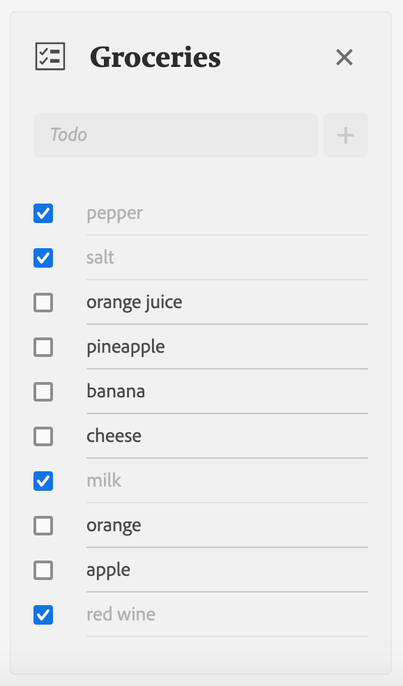
Lesson 5: Setup the TodoList component
In this lesson, we'll create a TodoList React component that will be able to:
- Create a new Todo item.
- Delete the whole todo list.
- Display Todo items we have built in the previous lesson.
We'll create the React component file under web-src/src/components/ and name it TodoList.js.
Import React Spectrum components
This component will make use of several React Spectrum components:
- View a generic container.
- Well a generic pre-styled container which will contain the todo list.
- Flex for the layout.
- Form to submit the todo.
- TextField the input field for the todo value.
- ActionButton to trigger form submission.
- AlertDialog to warn the user before deleting a todo list.
- DialogTrigger to open the AlertDialog.
Copied to your clipboardimport { View, Flex, Form, TextField, ActionButton, AlertDialog, DialogTrigger, Well } from '@adobe/react-spectrum';
Component properties
The component will accept 3 properties:
todoListwhich corresponds to the todo list object which holds the todo list name and todo items.onDeletethe callback function to delete a todo list.onUpdatethe callback function to update a todo list.
Copied to your clipboardfunction TodoList({ todoList, onDelete, onUpdate }) {const { name, todos } = todoList;// ...}
Spectrum Icons
We'll add React Spectrum Workflow Icons to the TodoList component. The icons are simply SVGs packed as React components.
To import icons, you have to install the @spectrum-icons/workflow dependency. It's pre-installed if you initialize the App Builder app with the React Spectrum template.
Each icon has to be imported individually with a single statement.
Copied to your clipboardimport TaskList from '@spectrum-icons/workflow/TaskList';import Close from '@spectrum-icons/workflow/Close';import Add from '@spectrum-icons/workflow/Add';
A searchable list of workflow icons is available on the Spectrum website. The name of the icon without any whitespace matches the import in React Spectrum.
Displaying the todo list name
React Spectrum has made available a set of components and keeps delivering new components with every release. Unfortunately, some components are not available yet in React Spectrum but available in Spectrum CSS which is the CSS framework used by React Spectrum to style components. Luckily for us, we can use React Spectrum together with Spectrum CSS to fill the gap of missing components.
In this case, we're going to install the Spectrum CSS Typography dependency to render Spectrum headings. Since React Spectrum already defines the Spectrum CSS variables, you'll only need to install the Spectrum CSS Typography package.
Copied to your clipboardnpm i --save @spectrum-css/typography
Then you can simply import the CSS with:
Copied to your clipboardimport '@spectrum-css/typography';
Now you can use the Spectrum CSS Heading classes to render the todo list name.
Copied to your clipboard<h2 className="spectrum-Heading spectrum-Heading--sizeM spectrum-Heading--serif">{name}</h2>
Rendering todo items
Once again, we're going to use the State hook useState to declare a state variable which will hold a list of todo items.
This list will be updated whenever a new todo item is created. By default, it's initialized with the todos from the todoList prop.
Copied to your clipboardconst [todoItems, setTodoItems] = useState(todos);
Next we'll iterate over the todoItems array using the map() function to render each item as Todo component.
Copied to your clipboard<View marginTop="size-100">{todoItems.map((todo) => (<Todo key={todo.id} name={name} todo={todo} onUpdate={onUpdate} />))}</View>
The key property is necessary in React to uniquely identify the todo item. In this case, we use the todo id.
You can read more about React lists and keys here.
We're also passing the name, todo and onUpdate props down to the Todo component.
Creating a todo item
If you remember in lesson 2, we defined a MAX_TODO_ITEMS value within a global configuration file defaults.json at the root of the App Builder App.
We'll use it to block the user from creating too many todo items inside a todo list. We can import the value similarly to what we have done in the Runtime action.
Copied to your clipboardimport { MAX_TODO_ITEMS } from '../../defaults.json';
Then we're going to use the React hook useState again to bind it to the TextField to create a new todo item similarly to the previous lesson.
Copied to your clipboardconst [newTodo, setNewTodo] = useState('');
This time we're going to disable the input once we reach the count of MAX_TODO_ITEMS by setting the isDisabled prop.
Copied to your clipboard<TextFieldautoComplete="off"isDisabled={todoItems.length >= MAX_TODO_ITEMS}aria-label="New todo"width="100%"value={newTodo}onChange={(value) => {setNewTodo(value);}}placeholder="Todo"minLength={1}maxLength={140}/><ActionButton type="submit" isDisabled={todoItems.length >= MAX_TODO_ITEMS}><Add /></ActionButton>
Finally, we'll wrap the TextField and the submit ActionButton with a Form component so that we can invoke the onUpdate callback function on form submission.
We'll prevent the default form submission behavior with event.preventDefault() and create a new todo item object that we pass to the callback function.
Additionally, we're clearing the value of TextField.
Copied to your clipboard<FormonSubmit={async (event) => {event.preventDefault();const index = todoItems.length;const newTodoItem = { name, id: index, value: newTodo, done: false };setTodoItems([newTodoItem, ...todoItems]);setNewTodo('');onUpdate && (await onUpdate(name, newTodoItem));}}>
Deleting a todo list
Next to the todo list name, we'll add a trigger to delete the list. The trigger will open an AlertDialog to warn the user about the destructive action.
Confirming the operation will simply call the onDelete callback function passing it the name of the todo list. The dialog will close itself automatically.
Copied to your clipboard<DialogTrigger><ActionButton isQuiet><Close /></ActionButton><AlertDialogtitle="Clear todo list"variant="destructive"primaryActionLabel="Delete"secondaryActionLabel="Cancel"onPrimaryAction={async () => {onDelete && (await onDelete(name));}}>This action will clear the todo list <strong>{name}</strong>. Are you sure you want to continue ?</AlertDialog></DialogTrigger>
Full component
Finally, we'll wrap the whole component inside a Well and use the Flex layout to vertically align the Todo items.
See the full component code here.

