CSS Styling
Style your plugin's user interface using CSS classes, inline styles, or JavaScript
UXP supports standard CSS for styling your plugin's interface. You can apply styles using CSS classes, inline styles, or JavaScript—choose the approach that fits your workflow best.
Prerequisites
Before you begin, make sure your development environment uses the following versions:
- Premiere v25.6 or higher
- UDT v2.2 or higher
- Manifest version v5 or higher
Overview
If you're new to UXP plugin development or coming from a native extension background, this section provides a quick reference for the three standard approaches to applying styles in UXP. While these methods mirror standard web development practices, it's worth noting how they work in the UXP context before exploring more advanced patterns like theme awareness.
Copied to your clipboard<!-- 1. Using CSS classes --><div class="green-background"><h1>Styled with CSS class</h1></div><!-- 2. Using inline styles --><div style="background-color: yellow;"><h1>Styled inline</h1></div><!-- 3. Using JavaScript --><div id="exampleDiv"><h1>Styled with JavaScript</h1></div>
Copied to your clipboard// Apply styles via JavaScriptconst exampleDiv = document.getElementById("exampleDiv");exampleDiv.style.backgroundColor = "orange";
Copied to your clipboard/* Define styles in a stylesheet */.green-background {background-color: green;}
Theme Awareness
Premiere supports theme awareness, which means that your plugin's UI can adapt to the user's chosen application theme—either, Light, Dark, or Darkest. In Premiere UXP plugins, the document object implements a theme property with a getCurrent() method that returns the current theme as a string.
Additionally, theme implements a onUpdated event listener that is triggered when the user manually changes it. Its callback can then update your plugin's UI with custom CSS classes to match the new theme.
Example: Change styles on the fly
Copied to your clipboard<body><h4 id="plugin-heading">Application Info</h4><div class="main-div"><div id="plugin-body"> </div></div><footer><button id="btnPopulate">Populate Application Info</button><button id="clear-btn">Clear Application Info</button></footer></body>
Copied to your clipboardfunction updateTheme(theme) {panelBody = document.getElementById("plugin-body");panelHeading = document.getElementById("plugin-heading");// Change styles based on the new theme on the flyif(theme.includes("dark")) {panelBody.style.color = "#fff";panelHeading.style.color = "#fff";} else {panelBody.style.color = "#000";panelHeading.style.color = "#000";}}// Listen for theme changesdocument.theme.onUpdated.addListener((theme) => {updateTheme(theme);})// Apply initial theme on loadconst currentTheme = document.theme.getCurrent();updateTheme(currentTheme);
Example: Switch theme Classes
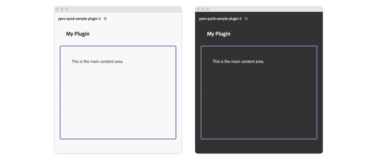
This example demonstrates how to use CSS custom properties (variables) to handle theme changes efficiently. The updateTheme() function applies a single theme class (theme-light or theme-dark) to the body element. When the theme changes, it removes the existing theme class and adds the appropriate one.
This approach leverages CSS cascade to update your entire plugin. In styles.css, you define CSS variables at the theme level—for example, --heading-color, --body-color, and --border-color. These variables are then referenced throughout the stylesheet using var(...). When you change the theme class on the body element, all elements automatically inherit the correct colors without requiring individual updates.
Copied to your clipboard<body><sp-heading>My Plugin</sp-heading><div class="plugin-body"><sp-body>This is the main content area.</sp-body></div></body>
Copied to your clipboardfunction updateTheme(theme) {// Apply theme to body element only - CSS variables will handle the restdocument.body.classList.remove("theme-light", "theme-dark");document.body.classList.add(theme.includes("dark") ? "theme-dark" : "theme-light");}// Listen for theme changesdocument.theme.onUpdated.addListener((theme) => {updateTheme(theme);});// Apply initial theme on loadconst currentTheme = document.theme.getCurrent(); // Returns "light", "dark", or "darkest"updateTheme(currentTheme);
Copied to your clipboard/* Theme CSS Variables */body.theme-light {--heading-color: #2c2c2c;--body-color: #4a4a4a;--border-color: #40548e;}body.theme-dark {--heading-color: #f5f5f5;--body-color: #e0e0e0;--border-color: #97ace6;}body {padding: 0 16px;}.plugin-body {margin-top: 5px;padding: 16px;overflow: scroll;height: 300px;border-radius: 4px;border: 2px solid var(--border-color);}sp-heading {padding: 16px 20px;margin: 0 0 12px 0;font-size: 18px;color: var(--heading-color);}sp-body {padding: 20px;margin: 0;line-height: 1.6;font-size: 14px;color: var(--body-color);}

UXP CSS Variables
Spectrum CSS variables that are available in other Creative Cloud applications (for example, --uxp-host-text-color) are not yet supported in Premiere. They will be added in a future release.
Important Considerations
UXP is not a browser
UXP does not support all CSS properties. For example, CSS Grid Layout is not available. Check the CSS reference for a complete list of supported properties.
CSS Preprocessors
UXP only understands standard CSS. If you want to use preprocessors like Sass or SCSS, you must transpile them to CSS before bundling your plugin. This requires build tools like Webpack and a slightly different debugging workflow.
Use Spectrum for Consistency
We recommend using Spectrum for UI elements whenever possible. Spectrum is Adobe's design system and provides a consistent look and feel across all Adobe applications.
Reference Material
- CSS Reference: complete list of supported CSS properties.
- Spectrum Web Components Reference.

